Messi Connect

Services
UX/UI Design
Design Systems
Marketing assets
Type
B2C • Mobile App
Role
Lead Product Designer
Year
2025
Project Overview
Messi Connect is an AI-powered storytelling platform where fans can relive iconic moments from Messi’s career and interact with him through video-call experience.
The AI listens to the user's voice, interprets their intent, and selects the most relevant response from a library of 300–400 pre-recorded videos, each tagged with detailed metadata.
The platform was designed as a white-label product that could eventually support other personalities beyond Messi.
Challenge
The product existed as an MVP with strong concept but struggling execution. When I joined, the core UX was fragmented, users were confused about the experience, and there was no foundation for scaling. My focus: redesign the entire user experience to address these three critical problems.
01
Users didn't understand what the product was about
02
Fragmented experiences within the product caused drop-off
03
There was no foundation for scaling to other personalities

Approach
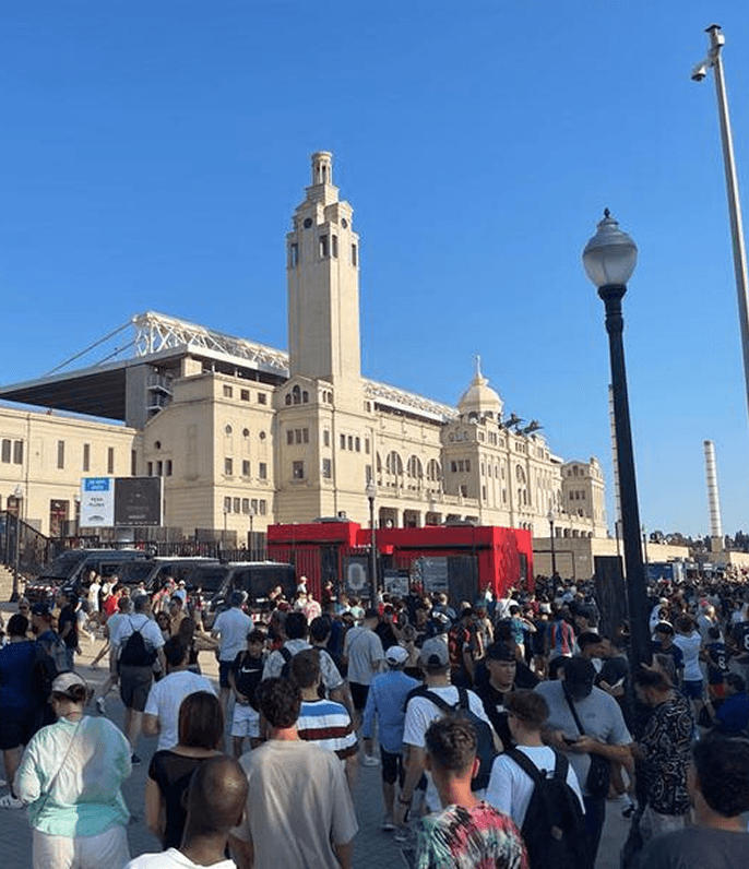
Talking to Fans in Barcelona
I'm hands-on. I went to Barcelona in the Barça uniform to conduct research and concept testing with around the stadium to understand how fans reacted to the product and the idea of “Talking to Messi” and what they actually expected. This helped us to shape the product strategy, and establish the priorities and features for the launch.


Approach
Talking to Fans in Barcelona
I'm hands-on. I went to Barcelona in the Barça uniform to conduct research and concept testing with around the stadium to understand how fans reacted to the product and the idea of “Talking to Messi” and what they actually expected. This helped us to shape the product strategy, and establish the priorities and features for the launch.
Key take aways
01
Excitement vs. confusion
Strong excitement and interest, but confusion about what the experience actually offered.
02
High bar for authenticity
Strong expectations for realism and personal-feeling content.
03
New interaction model needs guidance
The interaction model felt unfamiliar - users needed help understanding how to engage.
Design goals
Clarity
Help users understand a novel product. Guide them through sign-up, set expectations and explain the interaction model.
Frictionless
Remove friction from sign-up and onboarding so users actually enter the experience.
Conversion
Turn interest into action: improve the flows that get users from consideration to first interaction.
Scalability
Build a design system and foundation that supports Messi and enables expansion to other personalities.

Bringing it together
I tackled the design goals across three areas:
01
Redesigning the core user flows
02
Creating interaction structures that help users understand a novel experience
03
Building a comprehensive design system
Design Goal: Clarity & Conversion
Landing the value proposition
Research showed users were confused: we had no onboarding to explain the experience. I designed a four-screen walkthrough answering every question: what the product is, what you can do, why access is limited.
Result: +26% registration conversion.

Design Goal: Conversion
A strong Store presence
Bold visuals and clear positioning made Messi Connect unmistakable on the App Store.
Across 25 weeks (27K+ impressions):
11% average CTR (18.4% peak)
4.2% conversion to download (8.3% peak)
Refined through A/B testing and keyword localization (EN/ES).
Design Goal: Conversion
A strong Store presence
Bold visuals and clear positioning made Messi Connect unmistakable on the App Store.
Across 25 weeks (27K+ impressions):
11% average CTR (18.4% peak)
4.2% conversion to download (8.3% peak)
Refined through A/B testing and keyword localization (EN/ES).
Design Goal: Clarity & Conversion
Landing the value proposition
Research showed users were confused: we had no onboarding to explain the experience. I designed a four-screen walkthrough answering every question: what the product is, what you can do, why access is limited.
Result: +26% registration conversion.
Design Goal: Clarity
Setting expectations before sign-up
The authentication screen doubles as a preview of the experience. A background video shows how users interact with Messi, helping users understand the product before committing. This reduces uncertainty and increases motivation to continue.
Result: +26% registration conversion.
Design Goal: Frictionless
Frictionless sign-up
The original sign-up was fragmented and visually inconsistent. I redesigned it end-to-end: no scrolling, no distractions, just fast sign-up via Google, Apple, or email.

Design Goal: Clarity & Conversion
Designing for voice-first interaction
The AI listens to the user's voice, interprets intent, and selects from a library of 300–400 pre-recorded videos. The experience was designed to feel like an interactive story, combining conversational UI, video-first content and clear interaction cues that help users understand when to listen, speak and explore.
94% of users granted voice permissions, showing genuine engagement and trust.

Design Goal: Conversion
Gamifying the experience
Messi's content wasn't recorded yet at launch. To keep users engaged, I designed a progression system that rewarded exploration: match highlights creating natural re-entry points, an interactive globe mapping iconic moments to career milestones, and a set of collectable stickers that could be unlocked through replays.
This built habit and anticipation.
Design Goal: Conversion
Building urgency through exclusivity
Limited access and FOMO-driven messaging increased desirability.
The Home screen teased exclusive content available only to members, creating a clear incentive to convert.
Early push notifications drove 67% opt-in during onboarding.

Design Goal: Clarity & Scalability
A scalable Design System
I built a white-label design system that allowed new personalities to be introduced by updating the visual identity while keeping the underlying experience consistent.

Building a cohesive brand across touchpoints
Design Goal: Clarity & Conversion
I expanded the product experience beyond the app, designing the website and social presence to create a consistent, recognisable identity across platforms.
Aligning visual language, messaging and tone helped reinforce the concept, build trust early, and drive engagement from the first touchpoint.


Key take aways
01
Excitement vs. confusion
Strong excitement and interest, but confusion about what the experience actually offered.
02
High bar for authenticity
Strong expectations for realism and personal-feeling content.
03
Novel interaction needs guidance
The interaction model felt unfamiliar - users needed help understanding how to engage.
Design goals
Clarity
Help users understand a novel product. Guide them through sign-up, explain the interaction model, set expectations.
Frictionless
Remove friction from sign-up and onboarding so users actually enter the experience.
Conversion
Turn interest into action—improve the flows that get users from consideration to first interaction.
Scalability
Build a design system and foundation that supports Messi today and enables expansion to other personalities.
A strong Store presence
Design Goal: Conversion
Bold visuals and clear positioning made Messi Connect unmistakable on the App Store.
Across 25 weeks (27K+ impressions):
11% average CTR (18.4% peak)
4.2% conversion to download (8.3% peak)
Refined through A/B testing and keyword localization (EN/ES).
Frictionless sign-up
Design Goal: Frictionless
The original sign-up was fragmented and visually inconsistent. I redesigned it end-to-end: no scrolling, no distractions, just fast sign-up via Google, Apple, or email.
Designing for voice-first interaction
Design Goal: Clarity & Conversion
The AI listens to the user's voice, interprets intent, and selects from a library of 300–400 pre-recorded videos. The experience was designed to feel like an interactive story, combining conversational UI, video-first content and clear interaction cues that help users understand when to listen, speak and explore.
94% of users granted voice permissions, showing genuine engagement and trust.
Gamifying the experience
Design Goal: Conversion
Messi's content wasn't recorded yet at launch. To keep users engaged, I designed a progression system that rewarded exploration: match highlights creating natural re-entry points, an interactive globe mapping iconic moments to career milestones, and a set of collectable stickers that could be unlocked through replays.
This built habit and anticipation.
A scalable Design SystemDesign
Goal: Clarity & Scalability
I built a white-label design system that allowed new personalities to be introduced by updating the visual identity while keeping the underlying experience consistent.
Building a cohesive brand across touchpoints
Design Goal: Clarity & Conversion
I expanded the product experience beyond the app, designing the website and social presence to create a consistent, recognisable identity across platforms.
Aligning visual language, messaging and tone helped reinforce the concept, build trust early, and drive engagement from the first touchpoint.
Help users understand a novel product. Guide them through sign-up, set expectations and explain the interaction model.
Landing the value proposition
Design Goal: Clarity & Conversion
Research showed users were confused: we had no onboarding to explain the experience. I designed a four-screen walkthrough answering every question: what the product is, what you can do, why access is limited.
Result: +26% registration conversion.
Final outcome
- Highlights
I tackled the design goals across three areas:
01
Redesigning the core user flows
02
Creating interaction structures that help users understand a novel experience
03
Building a comprehensive design system
Building urgency through exclusivity
Design Goal: Conversion
Limited access and FOMO-driven messaging increased desirability.
The Home screen teased exclusive content available only to members, creating a clear incentive to convert.
Early push notifications drove 67% opt-in during onboarding.
Setting expectations before sign-up
Design Goal: Clarity
The authentication screen doubles as a preview of the experience. A background video shows how users interact with Messi, helping users understand the product before committing. This reduces uncertainty and increases motivation to continue.
Result: +26% registration conversion.
Services
UX/UI Design
Design Systems
Marketing assets
Type
B2C • Mobile App
Role
Lead Product Designer
Year
2025
Project Overview
The AI listens to the user's voice, interprets their intent, and selects the most relevant response from a library of 300–400 pre-recorded videos, each tagged with detailed metadata.
The platform was designed as a white-label product that could eventually support other personalities beyond Messi.
Messi Connect is an AI-powered storytelling platform where fans can relive iconic moments from Messi’s career and interact with him through video-call experience.
Challenge
The product existed as an MVP with strong concept but struggling execution. When I joined, the core UX was fragmented, users were confused about the experience, and there was no foundation for scaling. My focus: redesign the entire user experience to address these three critical problems.
01
Users didn't understand what the product was about
02
Fragmented experiences within the product caused drop-off
03
There was no foundation for scaling to other personalities
Approach
Talking to Fans in Barcelona
I'm hands-on. I went to Barcelona in the Barça uniform to conduct research and concept testing with around the stadium to understand how fans reacted to the product and the idea of “Talking to Messi” and what they actually expected. This helped us to shape the product strategy, and establish the priorities and features for the launch.
Key take aways
01
Excitement vs. confusion
Strong excitement and interest, but confusion about what the experience actually offered.
02
High bar for authenticity
Strong expectations for realism and personal-feeling content.
03
Novel interaction needs guidance
The interaction model felt unfamiliar - users needed help understanding how to engage.
Design goals
Clarity
Help users understand a novel product. Guide them through sign-up, set expectations and explain the interaction model.
Frictionless
Remove friction from sign-up and onboarding so users actually enter the experience.
Conversion
Turn interest into action: improve the flows that get users from consideration to first interaction.
Scalability
Build a design system and foundation that supports Messi and enables expansion to other personalities.
Setting expectations before sign-up
Design Goal: Clarity
The authentication screen doubles as a preview of the experience. A background video shows how users interact with Messi, helping users understand the product before committing. This reduces uncertainty and increases motivation to continue.
Result: +26% registration conversion.
Design Goal: Frictionless
Frictionless sign-up
The original sign-up was fragmented and visually inconsistent. I redesigned it end-to-end: no scrolling, no distractions, just fast sign-up via Google, Apple, or email.
Design Goal: Clarity & Conversion
Designing for voice-first interaction
The AI listens to the user's voice, interprets intent, and selects from a library of 300–400 pre-recorded videos. The experience was designed to feel like an interactive story, combining conversational UI, video-first content and clear interaction cues that help users understand when to listen, speak and explore.
94% of users granted voice permissions, showing genuine engagement and trust.
Design Goal: Conversion
Gamifying the experience
Messi's content wasn't recorded yet at launch. To keep users engaged, I designed a progression system that rewarded exploration: match highlights creating natural re-entry points, an interactive globe mapping iconic moments to career milestones, and a set of collectable stickers that could be unlocked through replays.
This built habit and anticipation.
Building urgency through exclusivity
Design Goal: Conversion
Limited access and FOMO-driven messaging increased desirability.
The Home screen teased exclusive content available only to members, creating a clear incentive to convert.
Early push notifications drove 67% opt-in during onboarding.
Goal: Clarity & Scalability
A scalable Design SystemDesign
I built a white-label design system that allowed new personalities to be introduced by updating the visual identity while keeping the underlying experience consistent.
Design Goal: Clarity & Conversion
Building a cohesive brand across touchpoints
I expanded the product experience beyond the app, designing the website and social presence to create a consistent, recognisable identity across platforms.
Aligning visual language, messaging and tone helped reinforce the concept, build trust early, and drive engagement from the first touchpoint.
Impact
+26%
Registration conversion uplift from clarity-first design
+67%
Pushed notifications opted in during onboarding
+4.2%
Conversion to download rate
+94%
Voice permissions granted from trust
Infinite
Personalities can be supported by the platform
Impact
+26%
Registration conversion uplift from clarity-first design
+67%
Pushed notifications opted in during onboarding
+4.2%
Conversion to download rate
+94%
Voice permissions granted from trust
Infinite
Personalities can be supported by the platform
Learnings
01
Reducing friction drives engagement
02
Trust is part of the experience
03
Systems thinking scales products
This project was full of firsts for me. It was my first time designing an AI-powered product and my first time building a design system that could support multiple brands. It pushed me to think beyond the immediate MVP and design foundations that could evolve as the product grew.
I also learned that successful products aren't defined by how many features they include, but by how quickly users experience value.
Designing the onboarding journey reinforced the idea that reducing friction has often a greater impact than adding functionality. Every decision; from simplifying registration to explaining permissions, was an opportunity for us to build trust and help users reach the core experience faster.
Related work

Services
UX/UI Design
Design Systems
Marketing assets
Type
B2C • Mobile App
Role
Lead Product Designer
Year
2025
Project Overview
The AI listens to the user's voice, interprets their intent, and selects the most relevant response from a library of 300–400 pre-recorded videos, each tagged with detailed metadata.
The platform was designed as a white-label product that could eventually support other personalities beyond Messi.
Messi Connect is an AI-powered storytelling platform where fans can relive iconic moments from Messi’s career and interact with him through video-call experience.
Challenge
The product existed as an MVP with strong concept but struggling execution. When I joined, the core UX was fragmented, users were confused about the experience, and there was no foundation for scaling. My focus: redesign the entire user experience to address these three critical problems.
01
Users didn't understand what the product was about
02
Fragmented experiences within the product caused drop-off
03
There was no foundation for scaling to other personalities
Impact
+26%
Registration conversion uplift from clarity-first design
+67%
Pushed notifications opted in during onboarding
+4.2%
Conversion to download rate
+94%
Voice permissions granted from trust
Infinite
Personalities can be supported by the platform