Flo Health
Reactivating users through design.
Creating a scalable email framework to re-engage users and ensure brand consistency across growth campaigns.
OVERVIEWAs part of Flo’s Growth team, I designed a new modular email system to boost user activation and retention. The goal was to reconnect with users who had previously been Premium, or were close to subscribing, while keeping the visual language consistent with Flo’s brand.
Impact
– Reduced production time by 40% for new campaigns, thanks to a modular, reusable system.
– Improved open rates and CTR across reactivation and activation flows through clearer structure and more relevant content.
– Increased return-to-app rates among previously Premium users by streamlining the value proposition and reducing friction.
– Established a scalable foundation for personalised, data-driven communication across future campaigns.
THE CHALLENGE
Flo needed a scalable and cohesive foundation for its emails, replacing fragmented, one-off designs that diluted the brand and slowed production. The system had to support diverse content - from supportive health insights to promotional nudges.
How might we design a modular structure that speeds up production, enhances brand consistency, and allows rapid testing across activation and reactivation journeys?

PROCESSI began by reviewing the existing email campaigns and running a competitor analysis, looking at tone, structure and visual patterns. This helped identify inconsistencies, hierarchy gaps, and opportunities to improve clarity and coherence across templates.
1. Audit & Research
Screenshot of some of the email research and competitor analysis
I created a modular email design system built around reusable components: headers, insight sections, data cards, and call-to-actions… that could easily adapt to different campaign needs. Each element was designed with Stripo implementation in mind, ensuring feasibility from the start. All components were created in Figma, responsive for both mobile and desktop, and optimised to be later built in Stripo (a tool similar to Mailchimp).
2. System Thinking
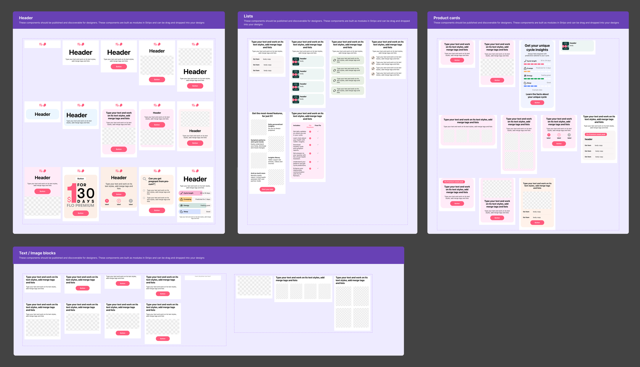
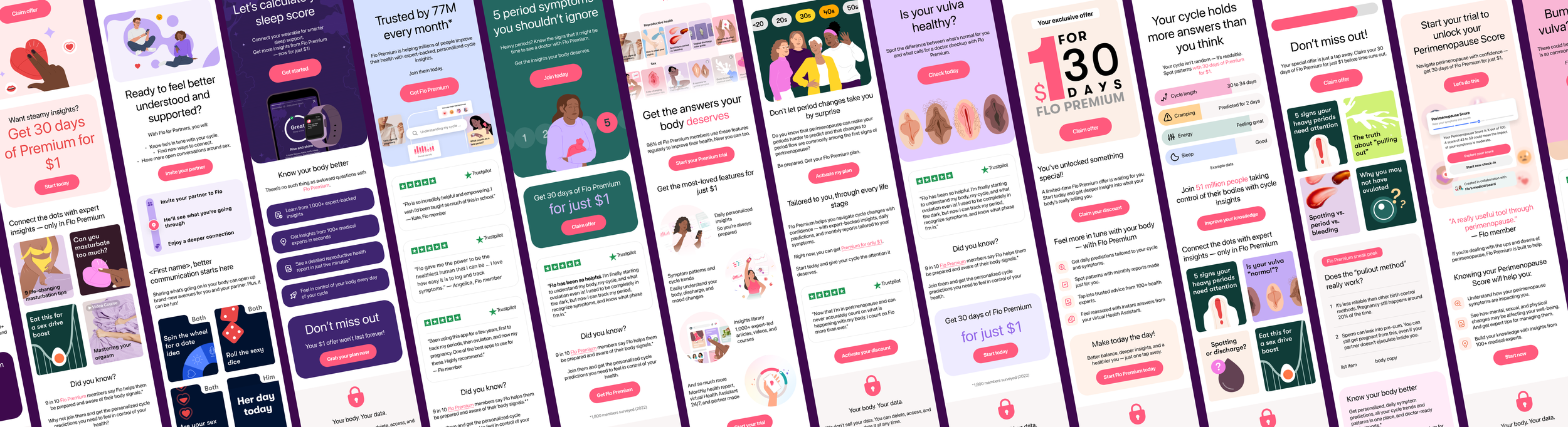
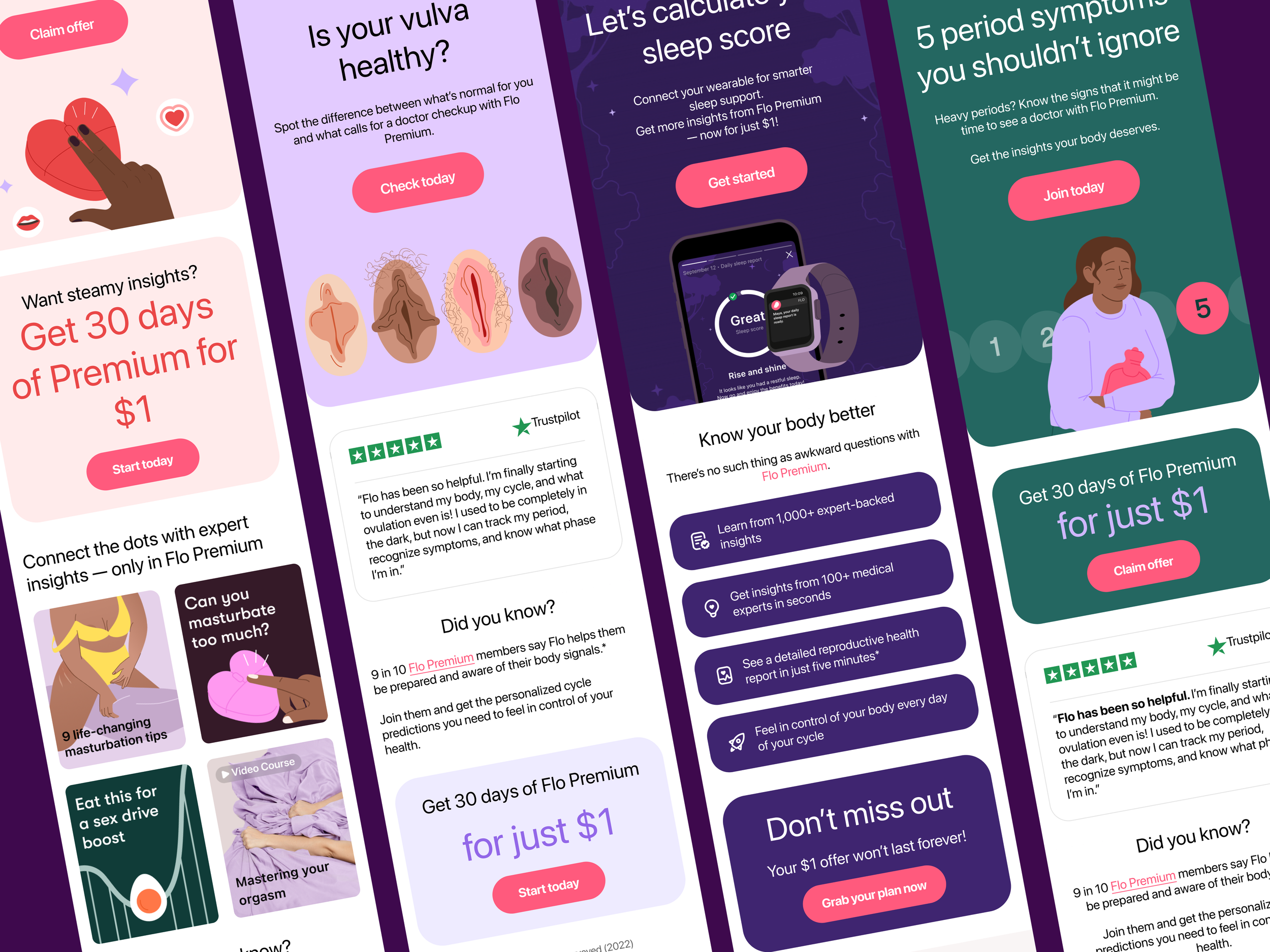
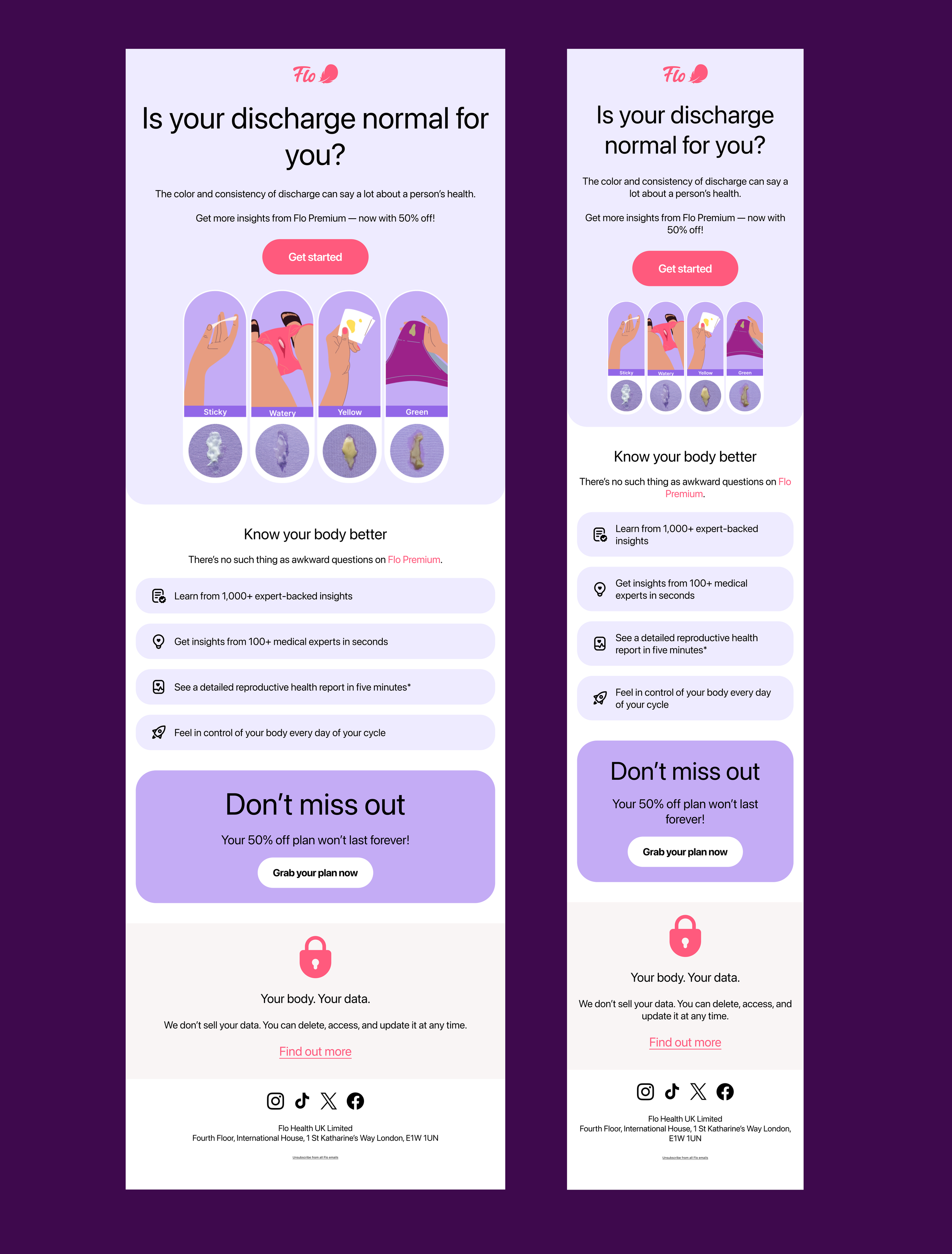
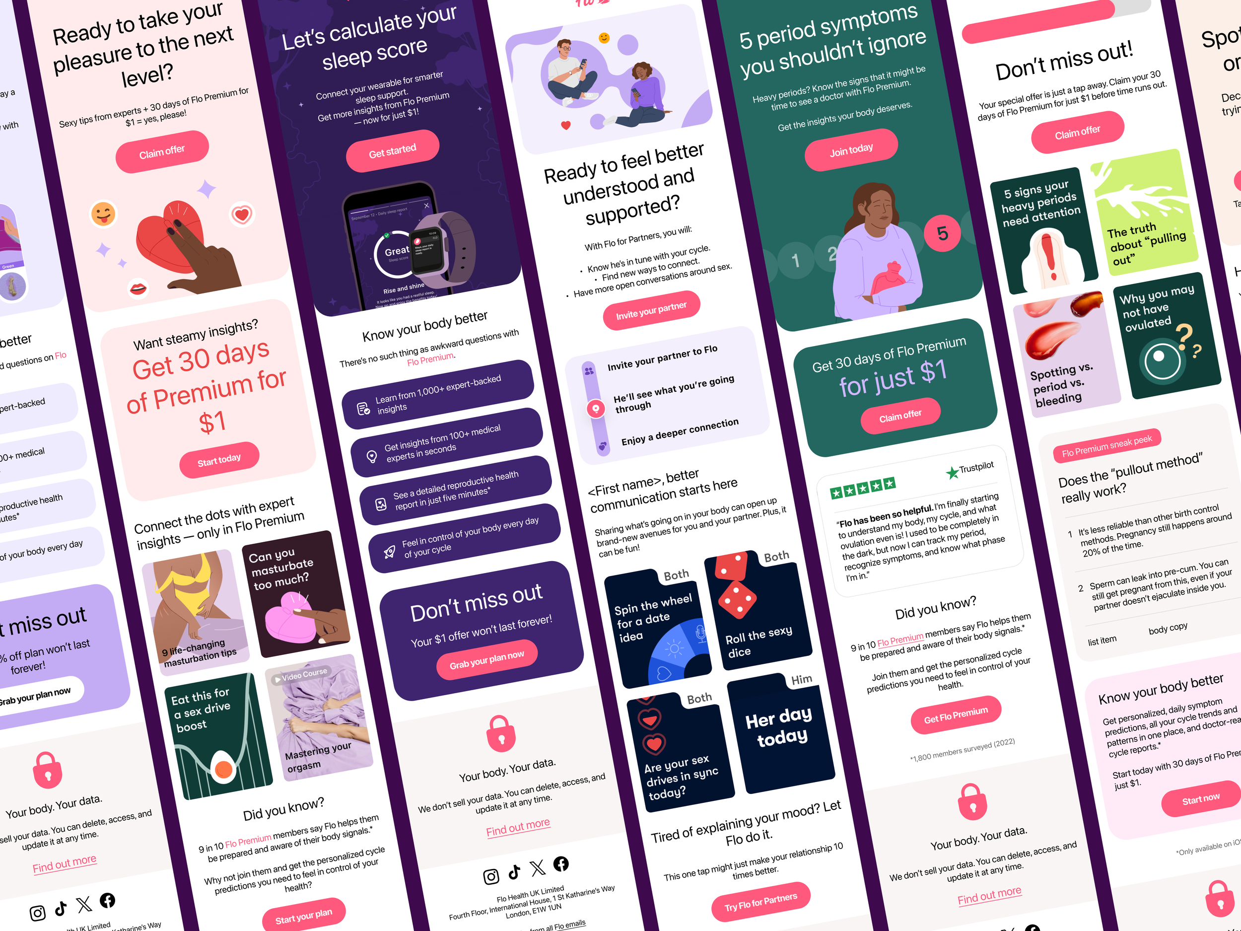
Email - UI Kit
I developed 18 email templates, each built from interchangeable components that could adapt to different types of information. To avoid repetition, I played with layouts and structure to keep each template fresh while staying on-brand. I used light colour accents, iconography and subtle motion details to make the information more intuitive and engaging.
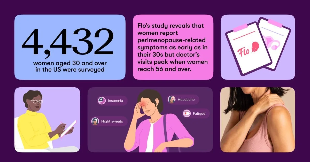
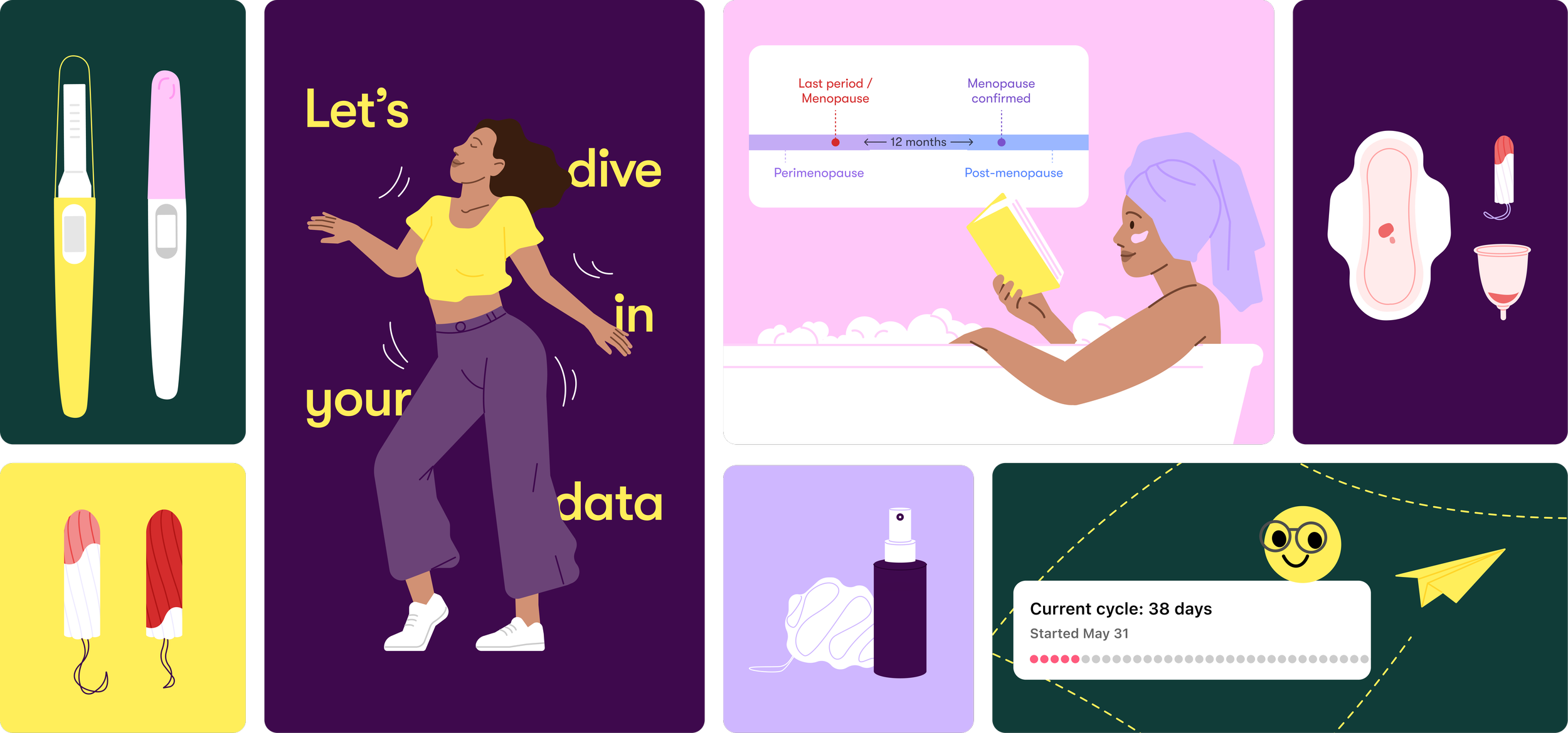
3. Data Visualisation & Content Representation
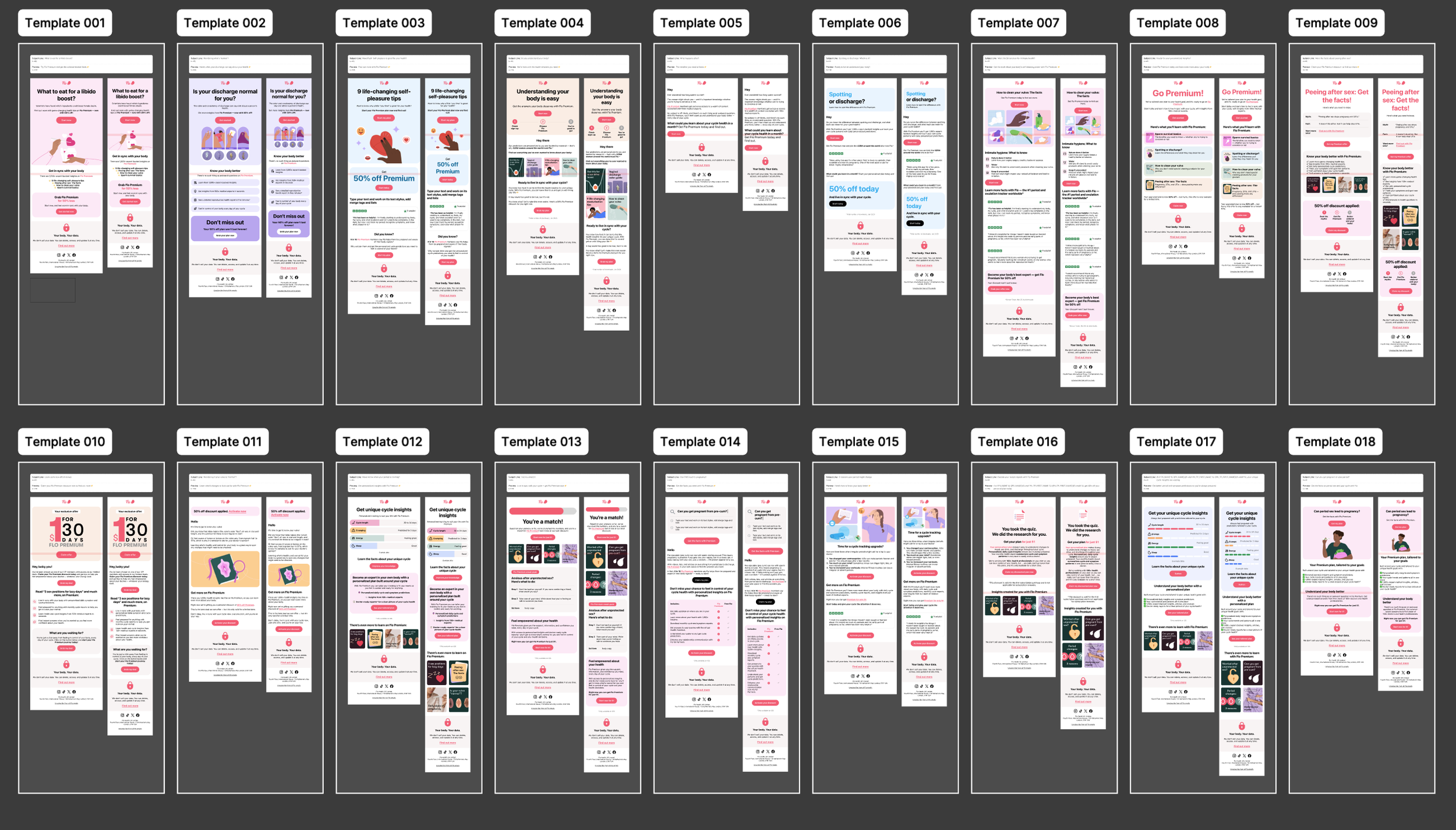
Email templates with interchangeable components
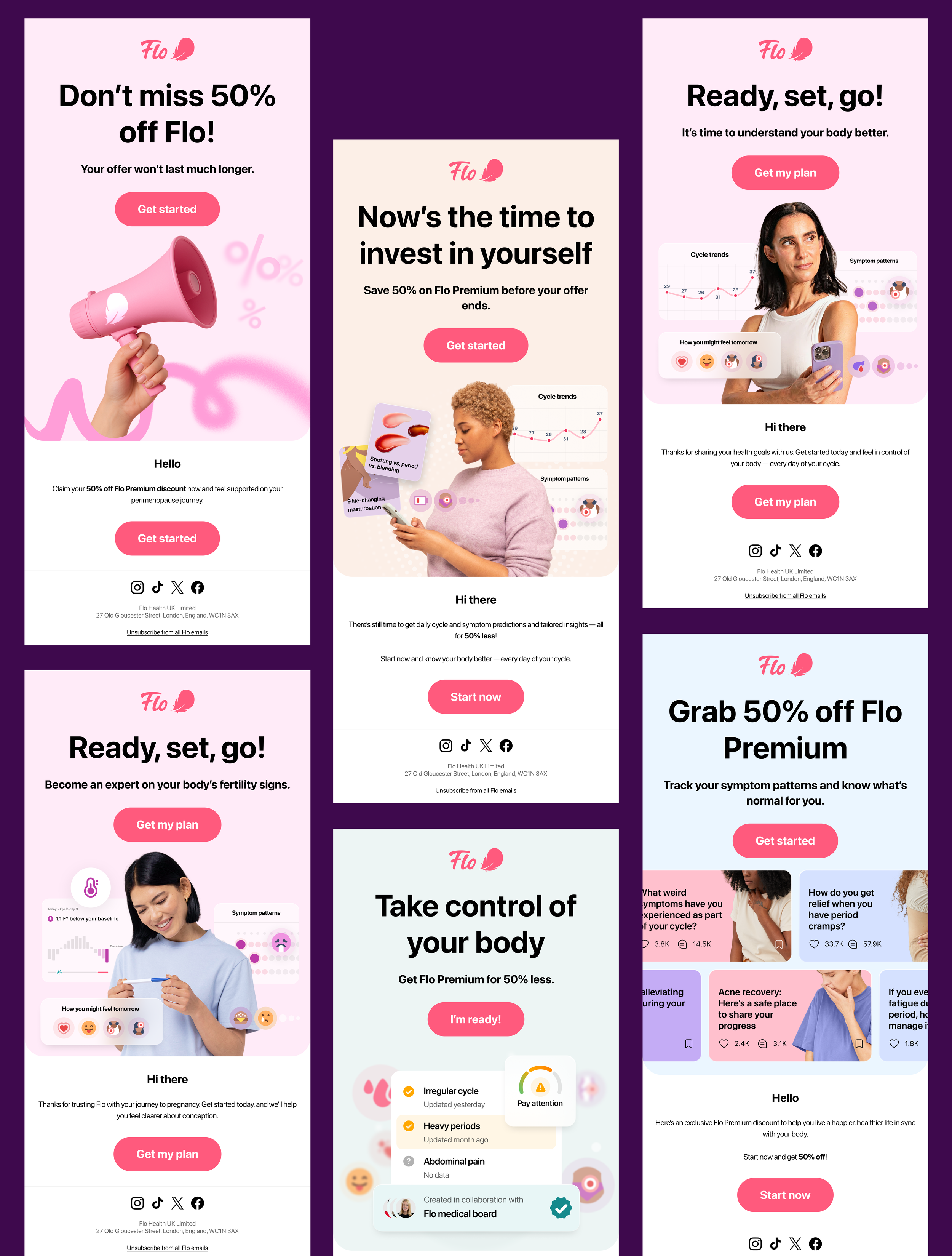
Working closely with Marketing and CRM teams, I defined a scalable structure that could be built in Stripo and easily updated by non-designers. I ensured consistency across clients (Gmail, Apple Mail, Outlook) and validated rendering for both light and dark modes.
4. Collaboration & Stripo implementation
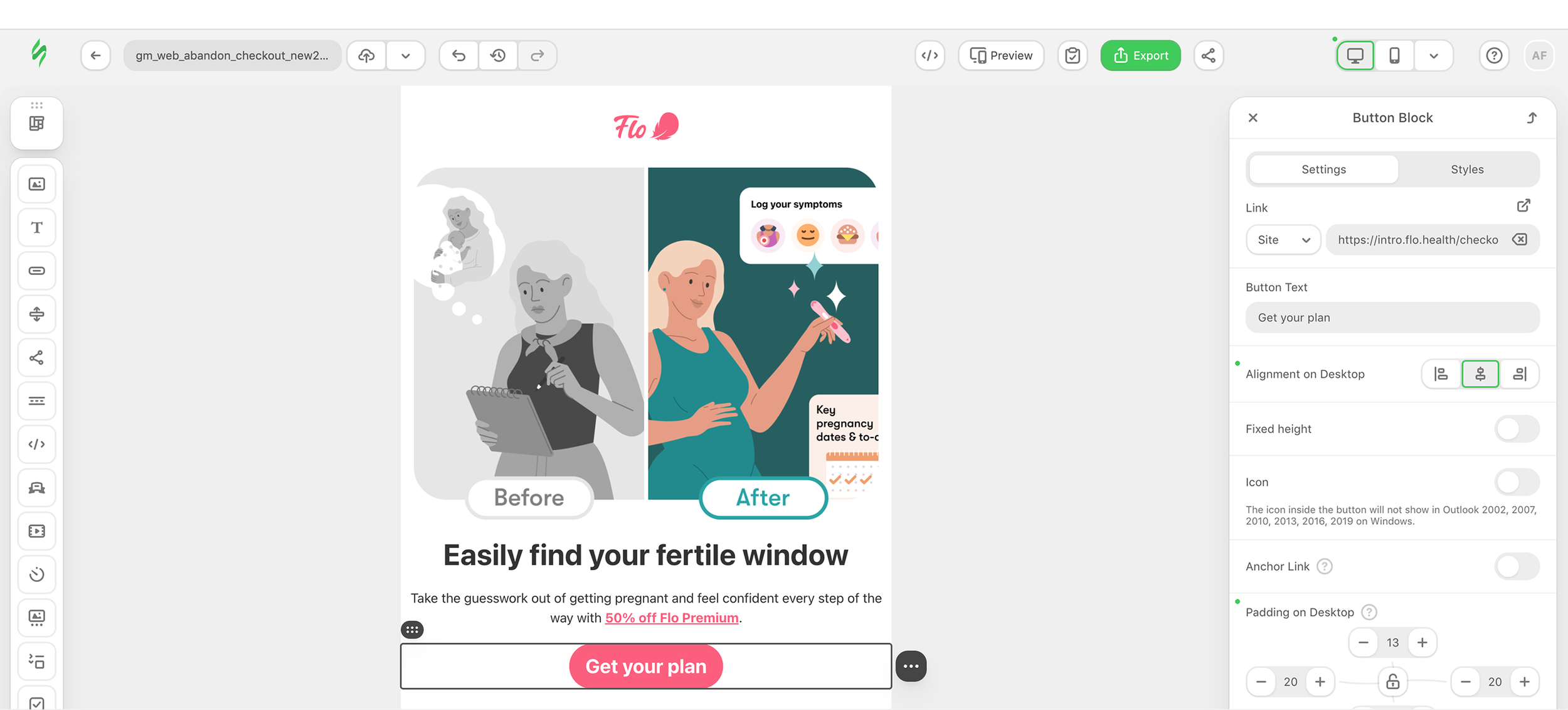
Screenshot of email being implemented in Stripo
SOLUTIONThe result was a modular email system with templates for all content types, easy to customise and visually coherent. All components were built to work seamlessly within Stripo’s constraints, ensuring smooth implementation.
Final Outcome