Continuity
Brand design
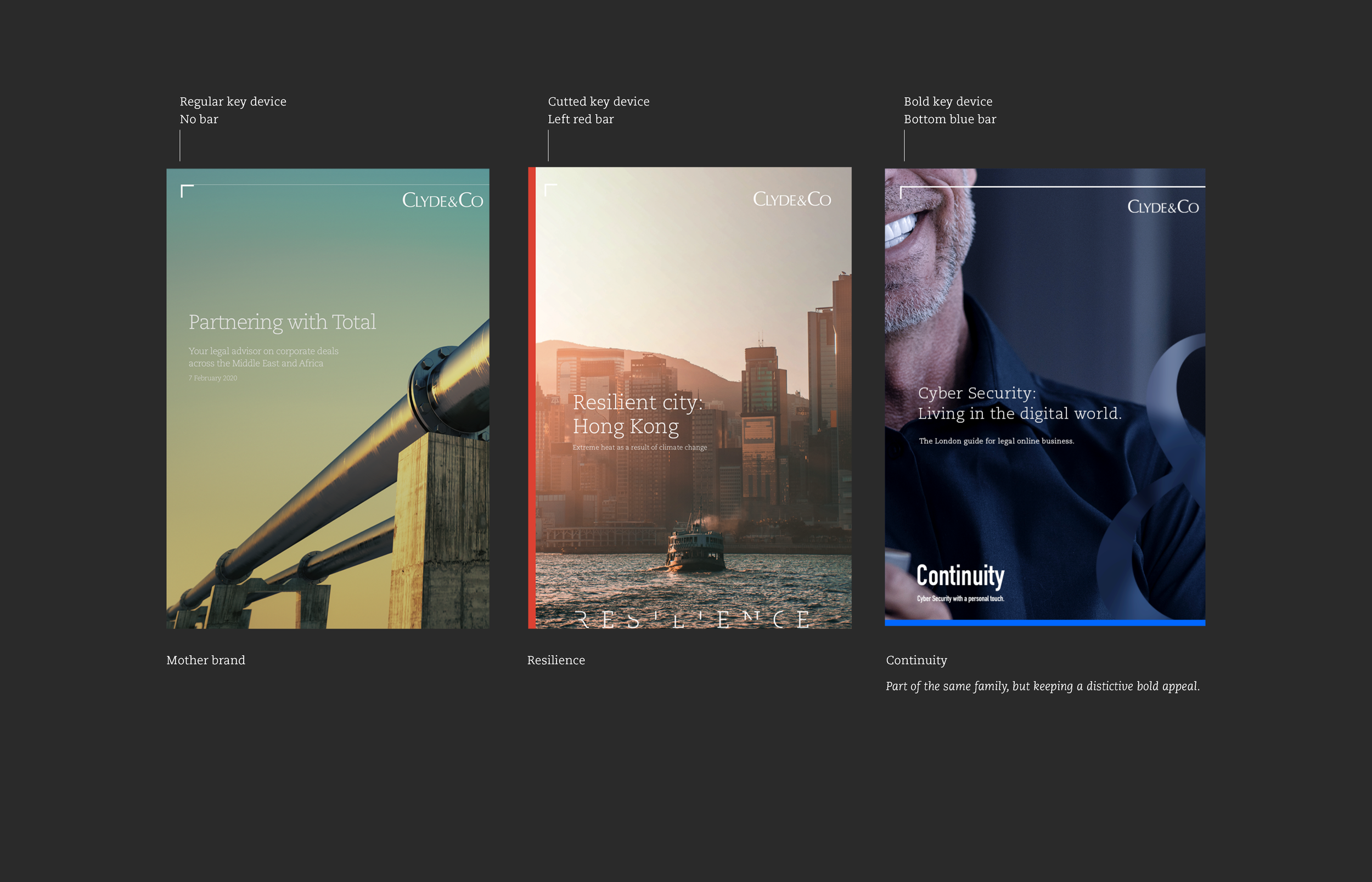
Clyde & Co's bold new sub-brand for 24/7 cybersecurity, which emphasises a human approach.

Clyde & Co, a global law firm, was launching a new 24/7 cybersecurity unit to support organisations during technology emergencies.
Beyond legal and technical expertise, this new branch wanted to emphasise something essential: the human response. In a digital crisis, clients don’t need robots — they need calm, clarity and someone they can trust.
The challenge was to create an identity that conveyed reassurance, speed and human presence, reflecting a global team ready to guide clients through high-pressure incidents and help them emerge stronger.
Concept & visuals
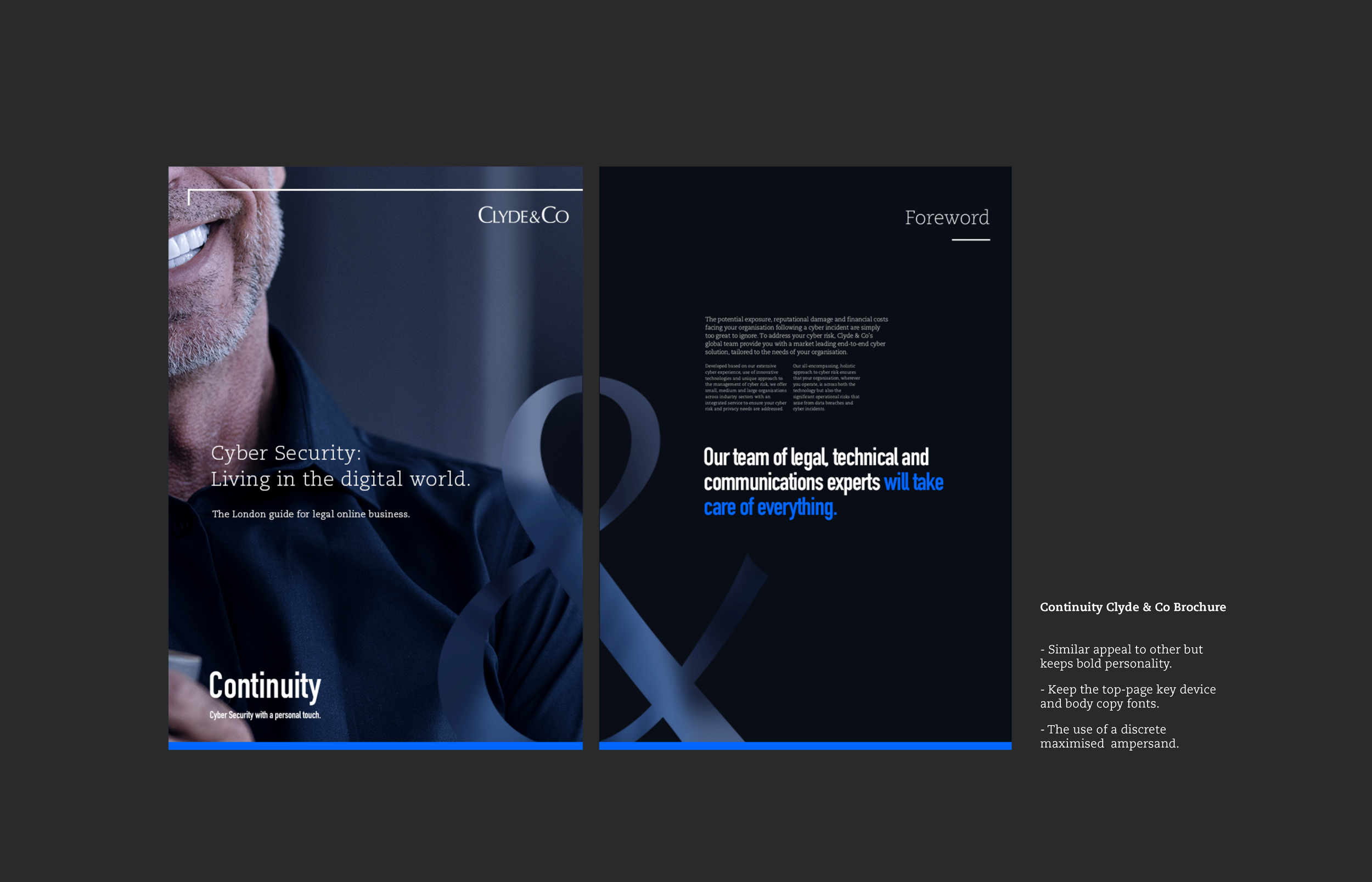
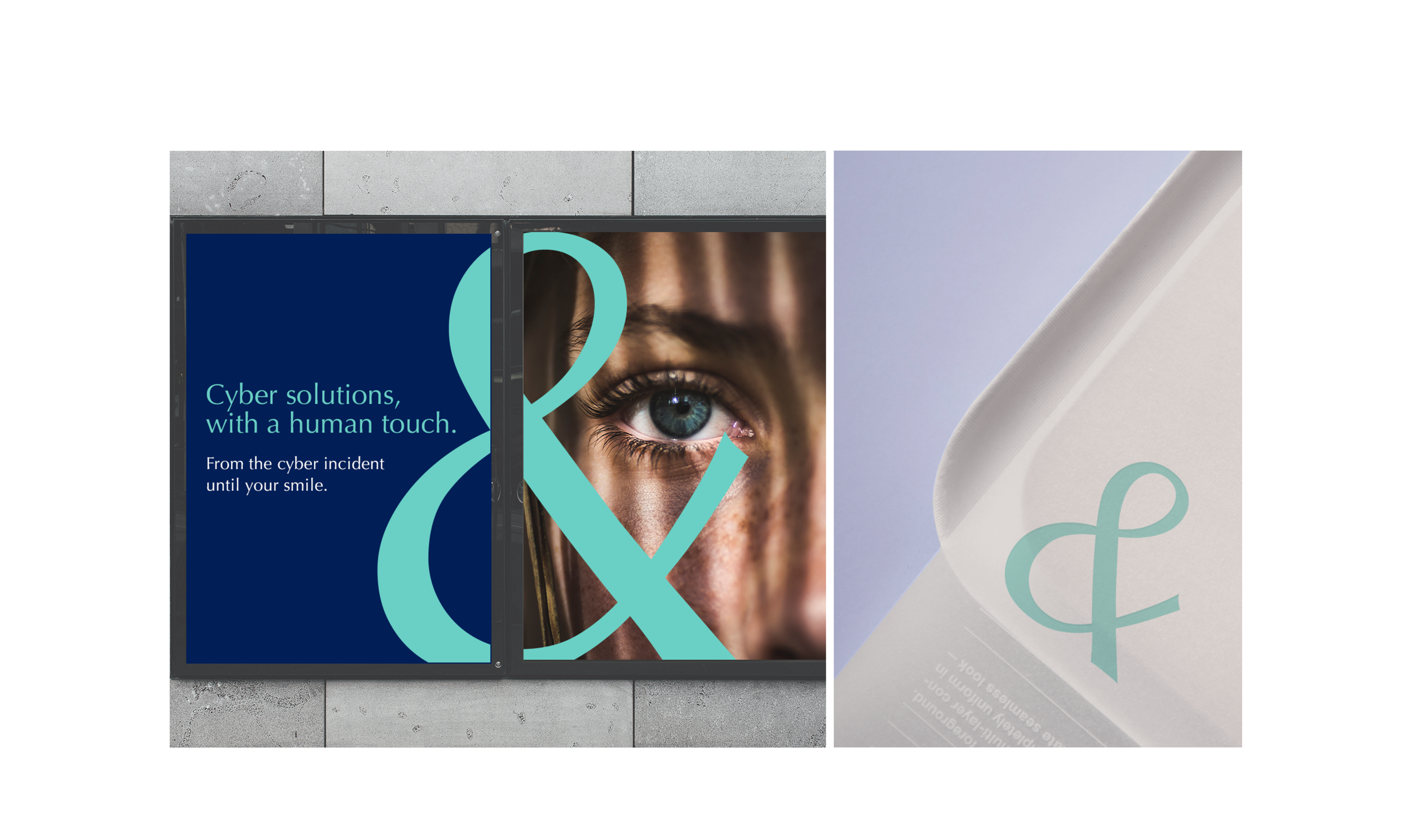
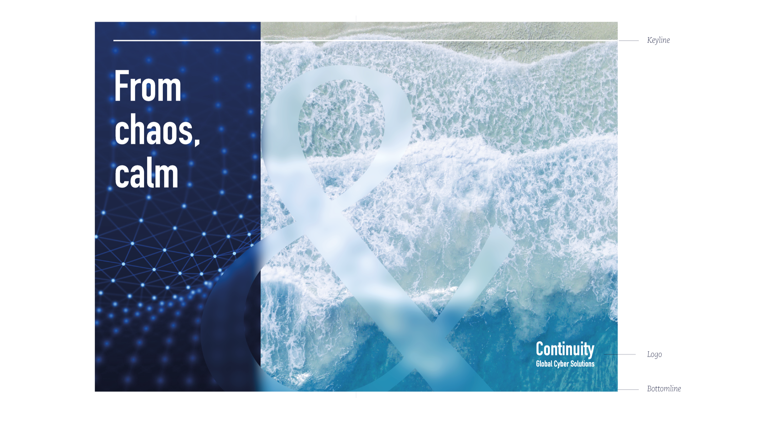
The ampersand is a strong symbol already present in the Clyde & Co logo. It represents connection, support and partnership, and people already recognise it as part of the brand.
Using it for Continuity felt like a natural choice: and a subtle wink to the mother brand.
It became the core idea of the concept: a way to show the link between a problem and its solution, and to combine two different ideas into one clear visual message.
Icons
A new range of icons have been developed to capture complex and abstract concepts in a way C&C hasn’t done before and that corresponds uniquely to the new Cyber sub-brand. The style of this icons is bold and modern, simple but still powerful. The icons will be used across all assets to represent each concept along cyber-attack process and services.Imagery
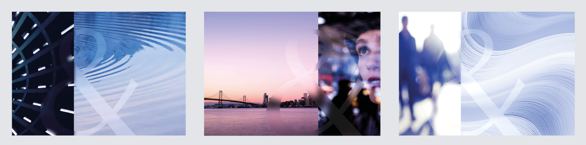
Our visual direction balances human warmth with the clarity of modern technology.
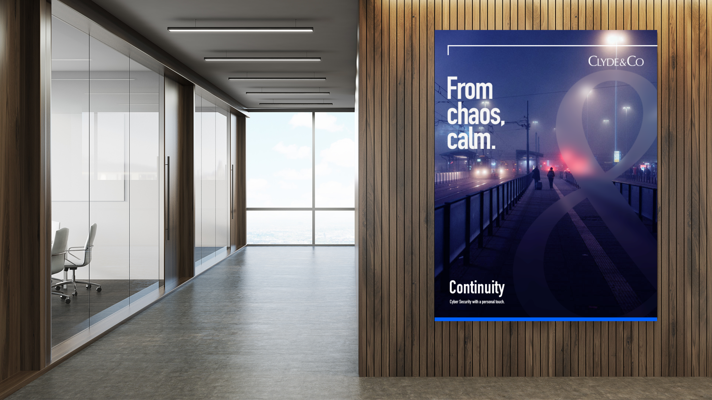
We curated four imagery pillars: city connections that show how people move through fast, architectural environments; human touch, using body parts and silhouettes (instead of faces) to convey presence and empathy; cyber shapes and textures that express the structure and complexity of digital systems; and a calm, resolved atmosphere that represents the outcome of our service — clarity, trust and peace of mind.


Concept
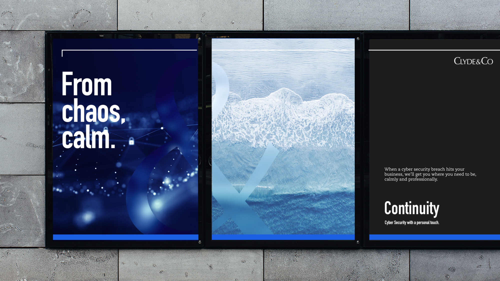
A core asset of the brand is the section spread: a landscape composition used as an inspiring visual anchor.
Each spread combines two contrasting images unified by a large ampersand and an aspirational tagline, creating a symbolic bridge between challenge and outcome. These mood spreads visually express the essence of Continuity: the service, the response, and the transformation clients experience.
Assets
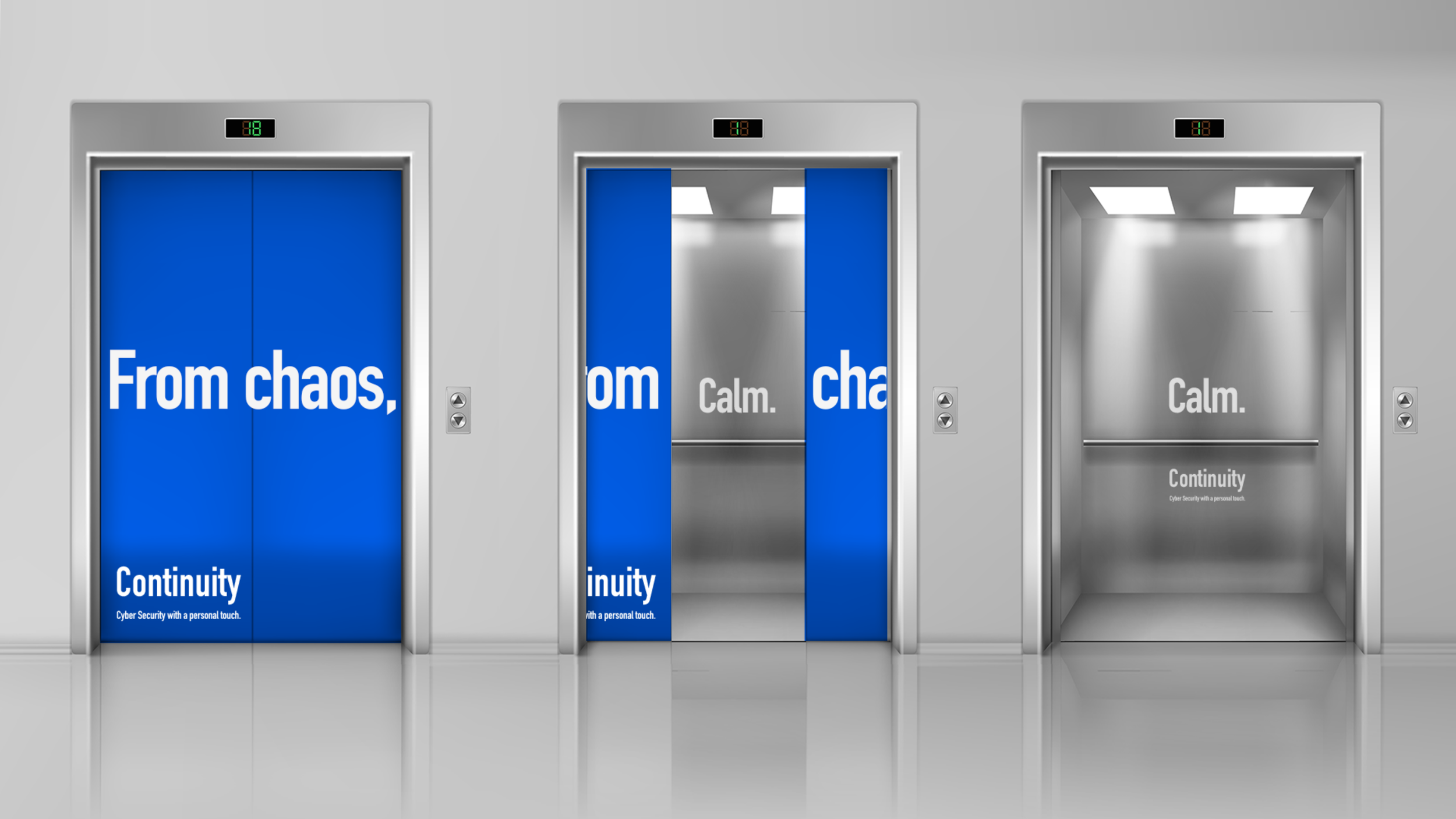
From the start, we explored how the brand could flex across multiple contexts and digital touchpoints.
Unlike Clyde & Co’s more traditional sub-brands, Continuity needed to live natively online, making it inherently more versatile and expressive. This gave us greater creative freedom to imagine how the identity behaves across platforms, scenarios and real-world applications.