Clyde guide
Product design · Research

INTRODUCTIONClyde & Co is a global law firm with a focus on five core sectors: insurance, energy, trade & commodities, infrastructure and transport.
The firm is organised in regions that work autonomously and often the partners don’t communicate within the different departments or regions across the globe.
The initial brief for this work was to create a pdf that would work as an agenda, but I just graduated from my UX course and saw this as an opportunity to put my knowledge into practice. I proposed them to work on a digital solution that could be easily updated and available for everyone in the firm instead of a pdf. They gave me green light an I immediately started to work on it.
MY ROLEResearch, analysis, product design, design systems, user-testing.
THE TEAMSolo project
TIMELINE6 weeks
THE PROBLEMThe law firm works with a big range of specialities, and partners don’t always have a comprehensive understanding of what the firm can offer beyond their own practice areas.
Clyde & Co doesn’t have a document that reunites all this information together.
How might we design a tool that allows users to be aware of the whole range of services that C&C offers?
THE APPROACHDuring this project, I used our client’s branding and insights to convert business requirements into a seamless usability experience.
The main goals were to keep people connected within the company, create awareness on the breadth of services that C&C offers, and increase cross-selling within the different departments.
PROTOTYPE CONSIDERATIONSClyde & Co is a client that so far was heavy print, so it was the first time that a project of this kind had been developed in the studio. Being pioneers in presenting a project like this, we encountered many questions and obstacles that we had to resolve:
Create a prototype that would work online and that did not have
the need to further develop (budget constraints);All the interactivity functions were kept active;
Anyone could have access without having to download
any software.
After testing several design & prototyping applications, we ended up designing the application in Sketch and adding the interactivity in Invision. We set it up as an internal project, being able to share a link, through which anyone could access - without having to download any software.
USER PERSONA
WIREFRAMES AND USER FLOWExample route: “Main home page” with access to the other sections
DESIGN SYSTEMFor designing the prototype, I needed to create the components in Sketch that had to be in line with their print brand guidelines, so they kept the same look and feel. This was a work that wasn’t done before; adapting the print guidelines to digital products.
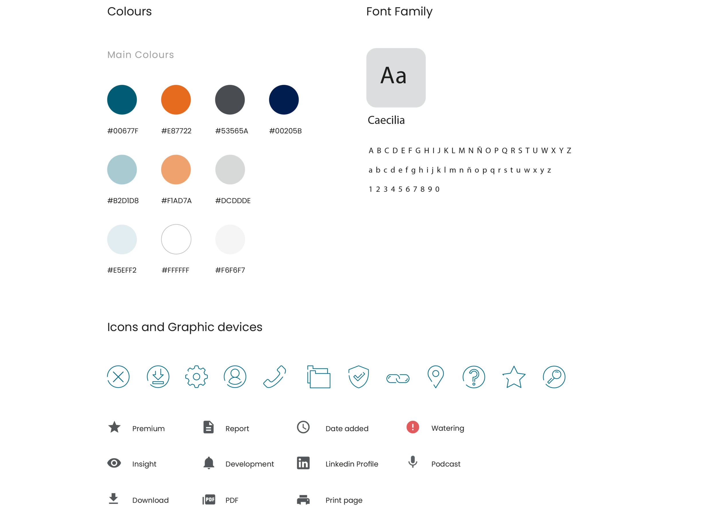

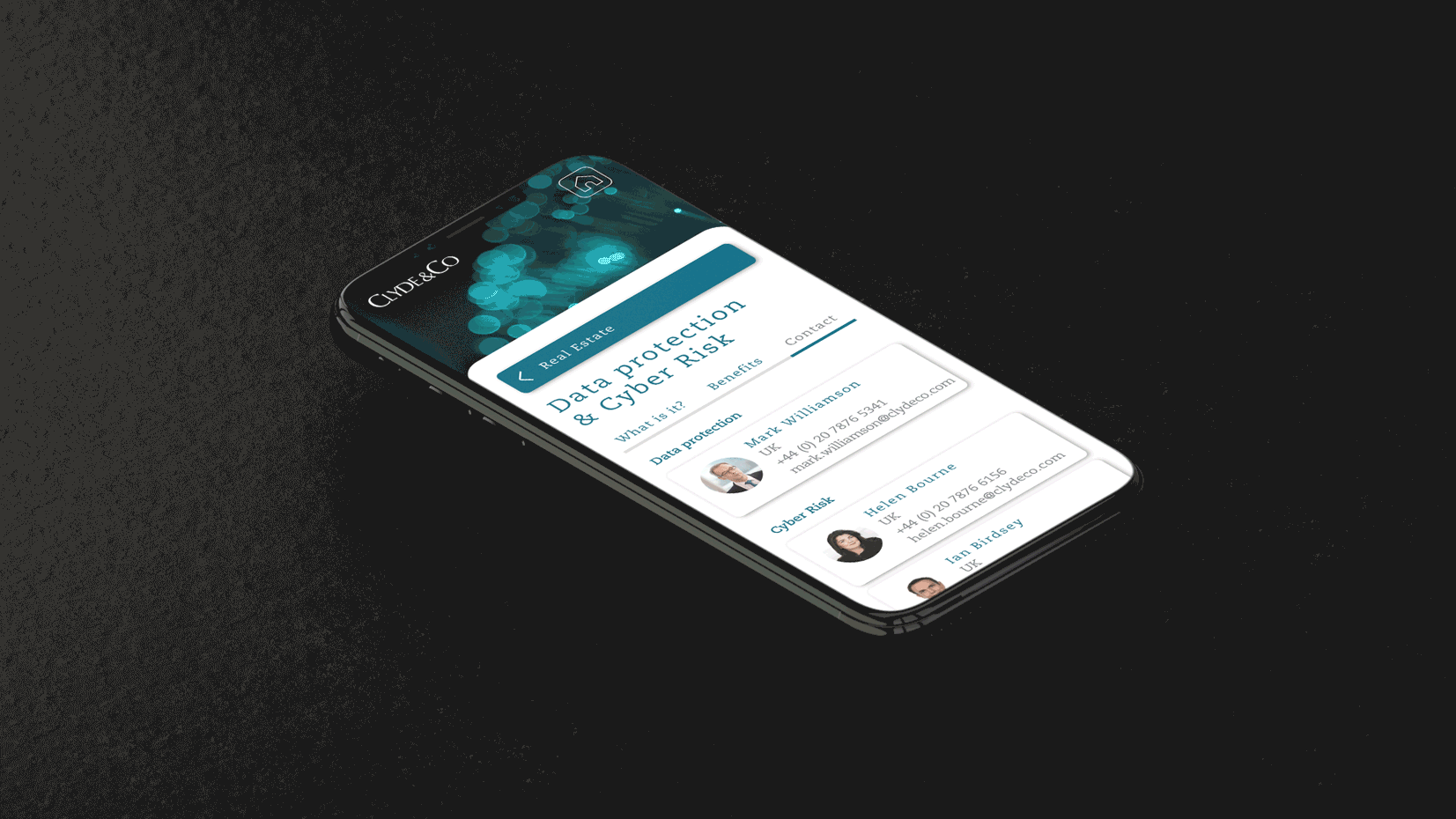
USER INTERFACE DESIGNThe objective of the interface was to keep the app as clear as possible, clean and very intuitive to use. This was accomplished through the use of white as a background colour, big pictures, clear and big buttons and CTAs; and icons in order to summarise and make information clearer.
The visual elements and the structure of the platform went through a lot of changes along the way that were finalised after several user testings with some of the partners at Clyde & Co.


OUTCOME AND LESSONSThe app was very well received in the firm that they actually asked for a budget for developing it. While has not yet been released and was kept in an MVP version, it has already increased communication within the C&C, and has been pointed as a milestone for good initiative of digital products to where the company wants to move towards.
After this prototype was created and shared within the partners and stakeholders, we started to receive a lot of briefings in the studio coming from different departments of the company asking for a similar product, increasing the profit for the agency I was working for.