Continuity

Scope
Brand strategy
Visual identity
Brand Guidelines
Role
Senior Brand Designer
Client
Clyde & Co
Year
2020
Project Overview
Creating a human, reassuring cybersecurity sub-brand for global law firm Clyde & Co.
Clyde & Co identified cybersecurity as a growing area of the business and created Continuity, a new service designed to support companies before, during and after a cyber attack.
Available 24/7, Continuity brings together legal, technical and communications expertise to help businesses respond quickly, minimise disruption and recover with confidence.
The challenge
Continuity needed enough personality to stand apart from Clyde & Co’s traditional service brands, while retaining the recognition of the parent brand. The identity also had to turn a complex, technical and high-pressure subject into something that felt human, approachable and easy to understand.
Create distiction
Establish a bold expression beyond Clyde & Co’s more traditional service brands.
Build trust
Replace fear and technical coldness from the indiustry with calm, confident human support.
Design for scale
Create a coherent system that could work across editorial, digital and physical touchpoints.

Creative direction
A visual journey from disruption to reassurance.
Four imagery pillars balance the pace and complexity of the cyber world with human presence and the calm that comes after an incident is resolved.





The identity system
A clearer, bolder voice
Condensed display typography gives the service immediacy and authority, balanced by Clyde & Co’s official serif voice for warmth and recognition.

Complex services, simplified
A bold icon family represents the stages and services involved in a cyber incident, making abstract ideas easier to understand.

Turning reassurance into a visual story
From chaos, calm.
Contrasting images create a repeatable bridge between the challenge and the outcome - the visual expression of what Continuity helps clients achieve.


Applications
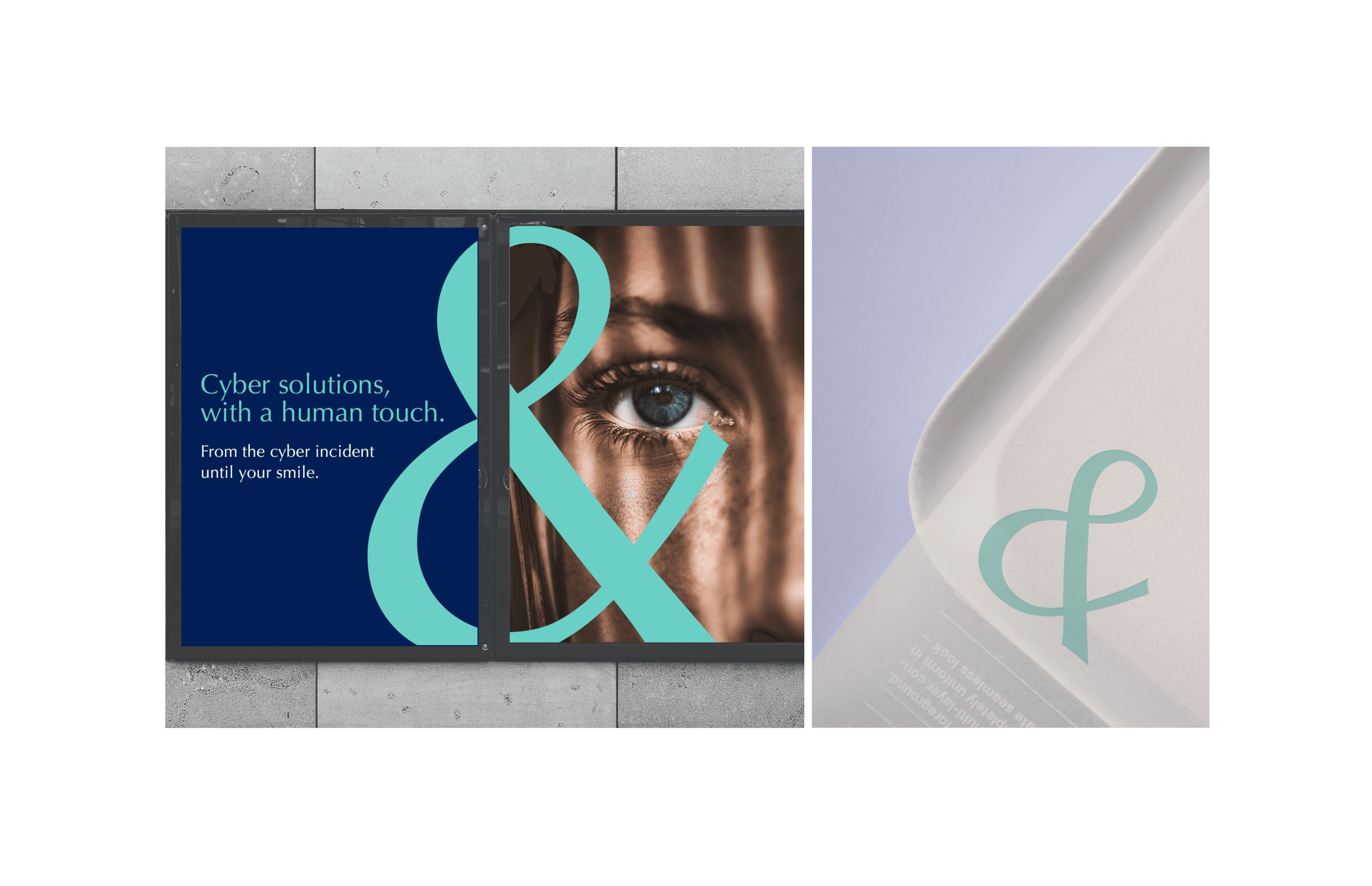
One system, built for every touchpoint.
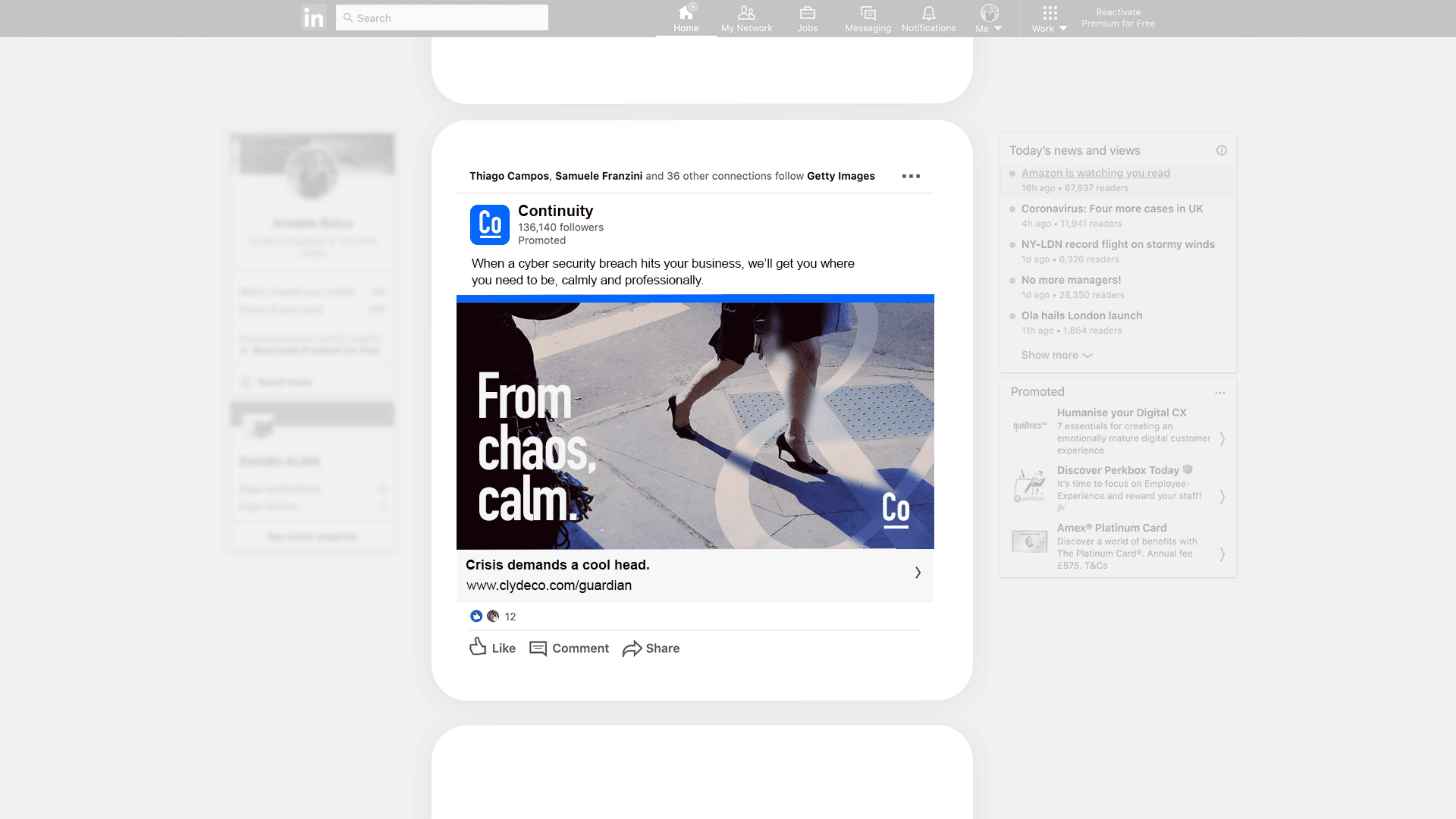
The identity was tested across campaign, editorial and digital formats from the beginning, allowing it to remain recognisable within the brand without becoming repetitive.




Outcome
A distinct identity that still feels part of Clyde & Co.
The final direction gave Continuity its own confident, human character while keeping a clear connection to Clyde & Co. The identity brought together typography, colour, imagery and iconography into a flexible system that could work across print and digital touchpoints.
Brand architecture
Imagery system
Print applications
Visual identity
Icon family
Digital touchpoints