Messi Connect
Designing the foundations of an AI-powered conversational experience.
OVERVIEW
Messi Connect is a FaceTime-style conversational experience where users talk naturally and receive video responses from Messi that feel like a real one-to-one interaction. The product uses an AI-powered engine that listens to the user’s voice, interprets their intent, and selects the most relevant response from a library of 300–400 pre-recorded videos, each tagged with detailed metadata.
When I joined, the concept existed, but the experience did not. I was responsible for making the app ready for Messi: structurally solid, user-friendly, and capable of supporting an AI-driven interaction.
My role
Lead Designer UX/UI
User research & analysis
Usability testing
Team
Product Manager
Technical Lead
Lead AI / Machine Learning
2 Developers
Q&A
Timeline
9 months
Problem
Messi Connect needed a clear, scalable foundation for a completely new type of video-based conversation. The team had an evolving AI pipeline that would listen, interpret and select the next best video answer, but the product experience was fragmented, half-built and lacked the structure needed to support this interaction.
How might we design a cohesive, human-centred experience that prepares users for an AI-powered conversation, clarifies expectations, and ensures the system feels smooth and intuitive from the very first interaction?
We delivered a stable, cohesive foundation that made the product ready for Messi.
Replaced fragmented, half-built flows with a clear end-to-end journey.
Improved sign-up and onboarding, increasing the number of users who entered the experience.
Created the user-facing structure the AI needs to work smoothly: guidance, interaction controls and recovery paths when things go wrong.
Introduced a full design system that aligned visual language, interaction patterns and development.
Created the foundation needed for the team to add Messi’s filmed content smoothly once available.
RESEARCH
Talking to Fans in Barcelona
Before designing the experience, I visited Barcelona to understand how fans reacted to the idea of “talking to Messi”. I conducted informal interviews and concept testing around the stadium and fan areas.
WHAT WE LEARNED✅ High emotional appeal and curiosity around the concept
✅ Strong expectations about how “real” the experience should feel
✅ Users were unclear about what the app would include or offer
✅ Clear interest in seeing exclusive, personal-feeling content from Messi
✅ People wanted clarity on why they should use it, what they would get, and whether it would feel worth paying for
DESIGNING THE FOUNDATIONS OF AN AI-DRIVEN EXPERIENCEThe app’s authentication flow was fragmented and visually inconsistent.
I redesigned the full sign-in/sign-up experience to reduce cognitive load, improve clarity and speed, and provide a stronger foundation for conversion once the conversational feature goes live.
Clean and frictionless sign-up
A conventional onboarding wasn’t enough — users needed to understand how to talk to an AI and what to expect from a video-based conversation.
Setting users up for a smooth first conversation
KEY TAKE AWAYS
Faster turnaround Times
Some queries must be resolved in less than 24 hours, while urgent ones need responses in under 3 hours.
Capacity to handle high-volume requests
The system must handle a high volume of daily requests efficiently and consistently.
Clear team communication
Legal reviews often involve multiple departments, so a clear communication flow is essential to avoid delays or confusion.
DESIGN PRINCIPLES
✨ Simple
Complex workflows are turned into clean, minimal interfaces that reduce friction and keep focus on the task.
🤝 Collaborative
Feedback and decisions happen in one place, improving transparency and alignment between teams.
🧩 Cohesive
A unified visual language and shared patterns make the Legal module feel like a seamless part of the existing tools.
⚡ Efficient
Every interaction is designed to accelerate turnaround times — enabling quick decisions, fewer clicks, and more visibility across stages.

INITIAL CONCEPT
Based on the workflow audit and user interviews, I created a set of key screens that reflected the actions the Legal team was actually performing. They were designed to fit within the existing internal tool, following and respecting the current UI and design system to keep the product cohesive.
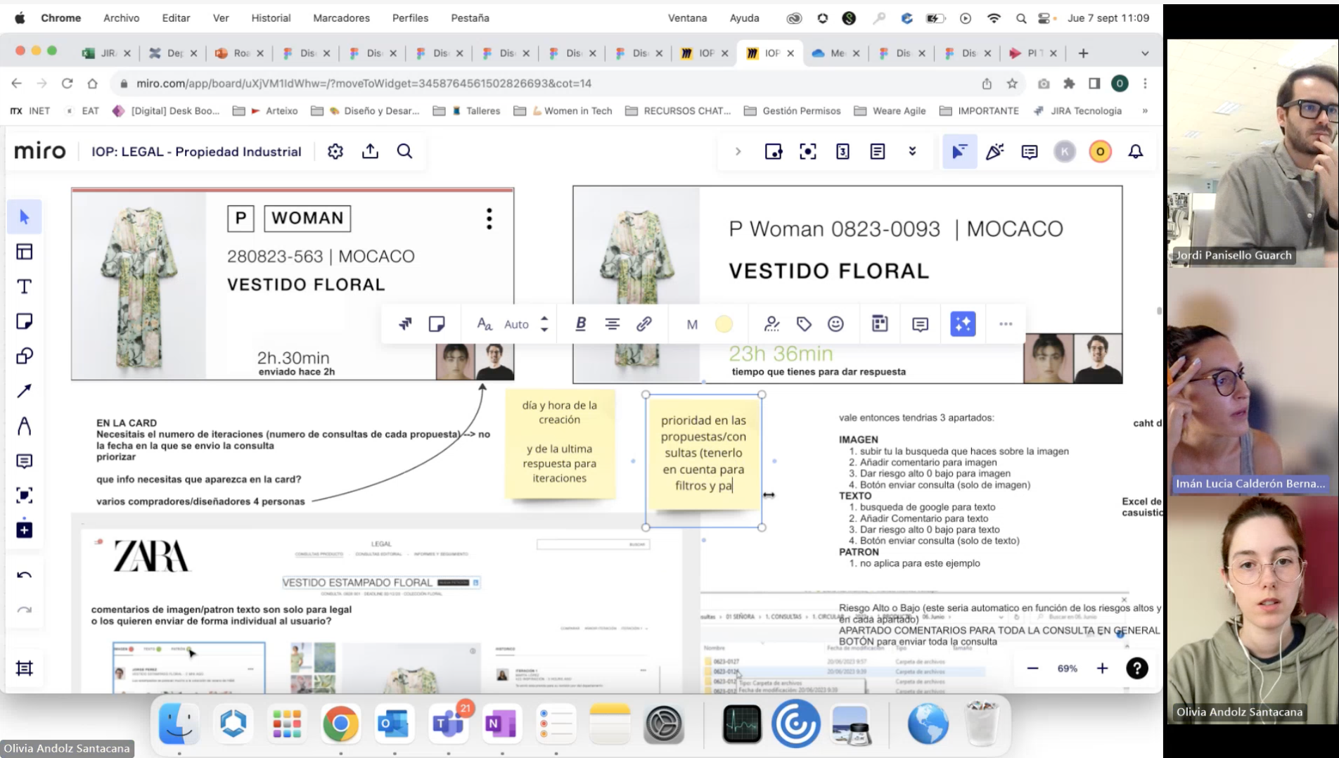
ITERATIVE FEEDBACK SESSIONS
After designing the first key screens, I conducted several feedback sessions with the client to review the proposal and uncover additional needs that hadn’t been identified at the start. These discussions helped refine the approach and ensure alignment with their expectations.

Leading a cross-department call to align on priorities and next steps.
Client feedback session on card info and preview states.
SOLUTION
Final outcome
- Highlights
Each highlight showcases a key aspect of the new Zara internal tool. For every feature, I’ve outlined:
The design goal it supports
The user problem or scenario it addresses
The solution implemented to solve it
A video demonstration showcasing how the Legal Department tool seamlessly integrates with the Zara Design tool and collaborates with other departments.
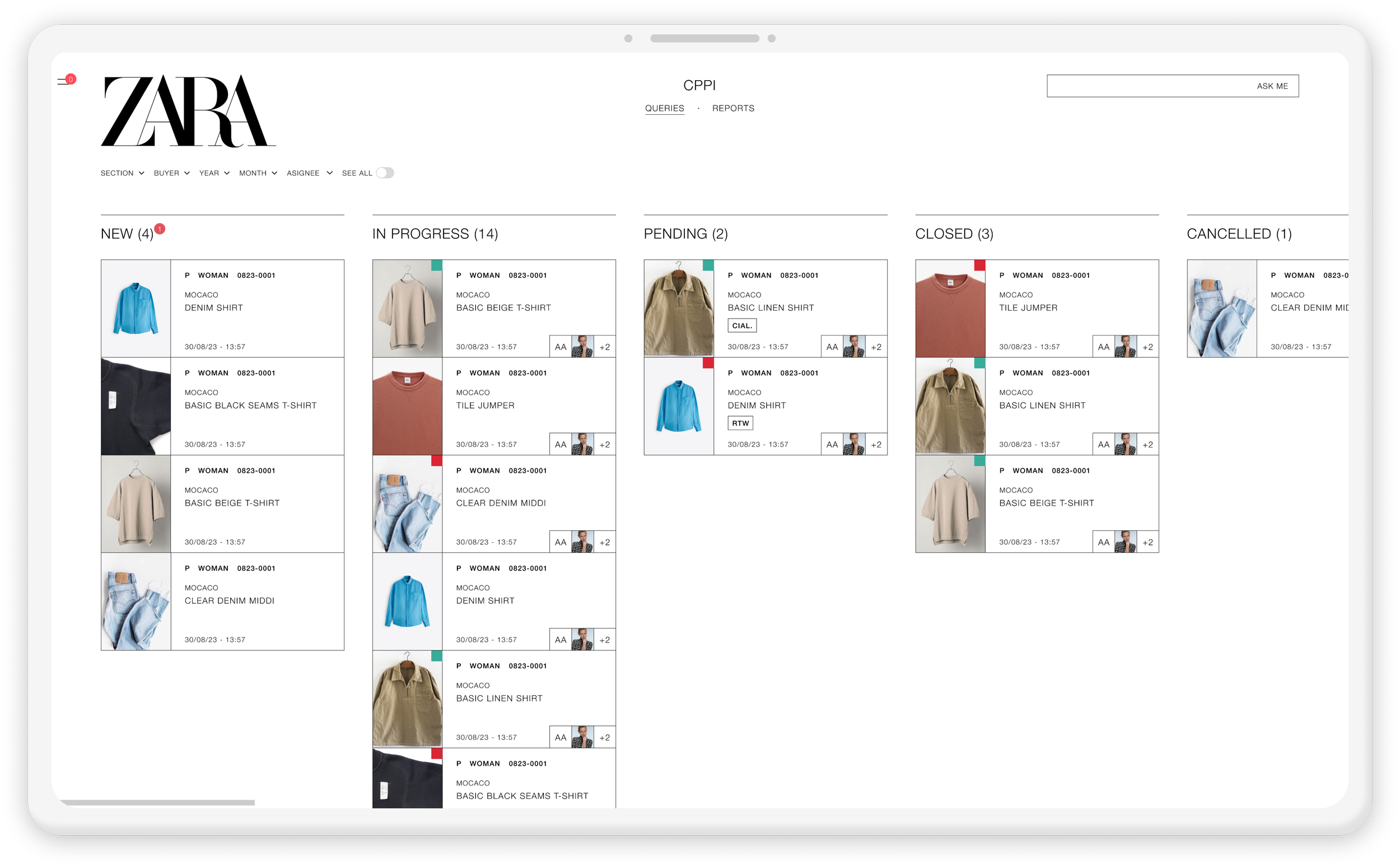
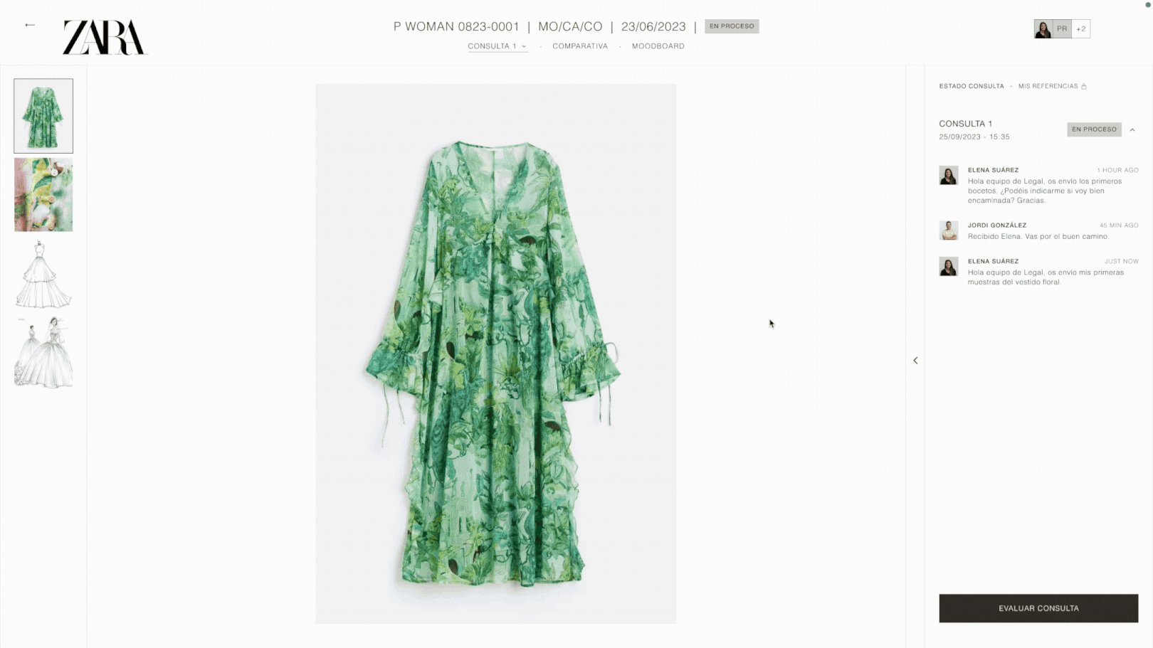
Query cards
Each enquiry appears as a card with all key details at a glance — product image, department, reference number, title, risk level, last interaction, and collaborators.
This layout makes it easy to scan, prioritise, and understand status and ownership without opening each item.

Feature #1
Design goal: Efficiency
Kanban for queries
Before, enquiries arrived by email, making ownership and status unclear. With the Kanban system, everything sits in one place. Each enquiry moves through stages (New, In Progress, Pending, Resolved, Cancelled), and the team can filter or check status at a glance.
This solves the problem of lost emails and confusion, making it clear who owns each enquiry and what needs to happen next.
Feature #2
Design goal: Collaborative
Moodboard
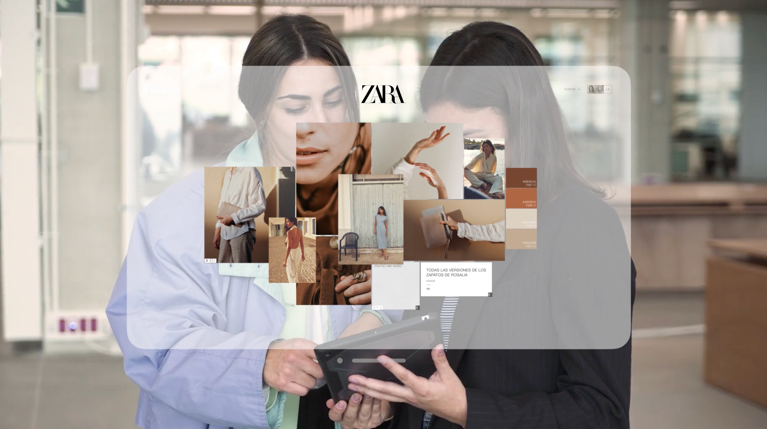
The Legal team can revisit the Moodboard to see the inspiration images designers used and check that none are too close to the final design.
Sharing the same visual references makes the process more transparent and supports faster, clearer decisions.
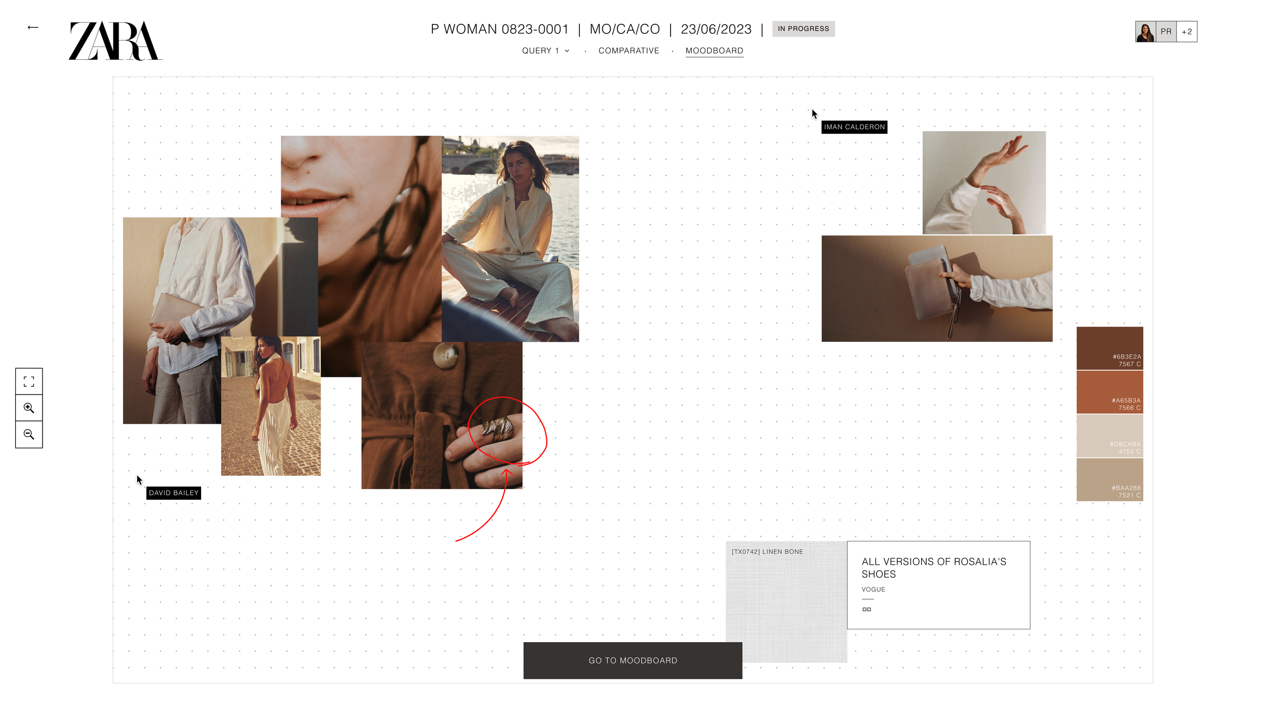

Opens Designer’s visual references
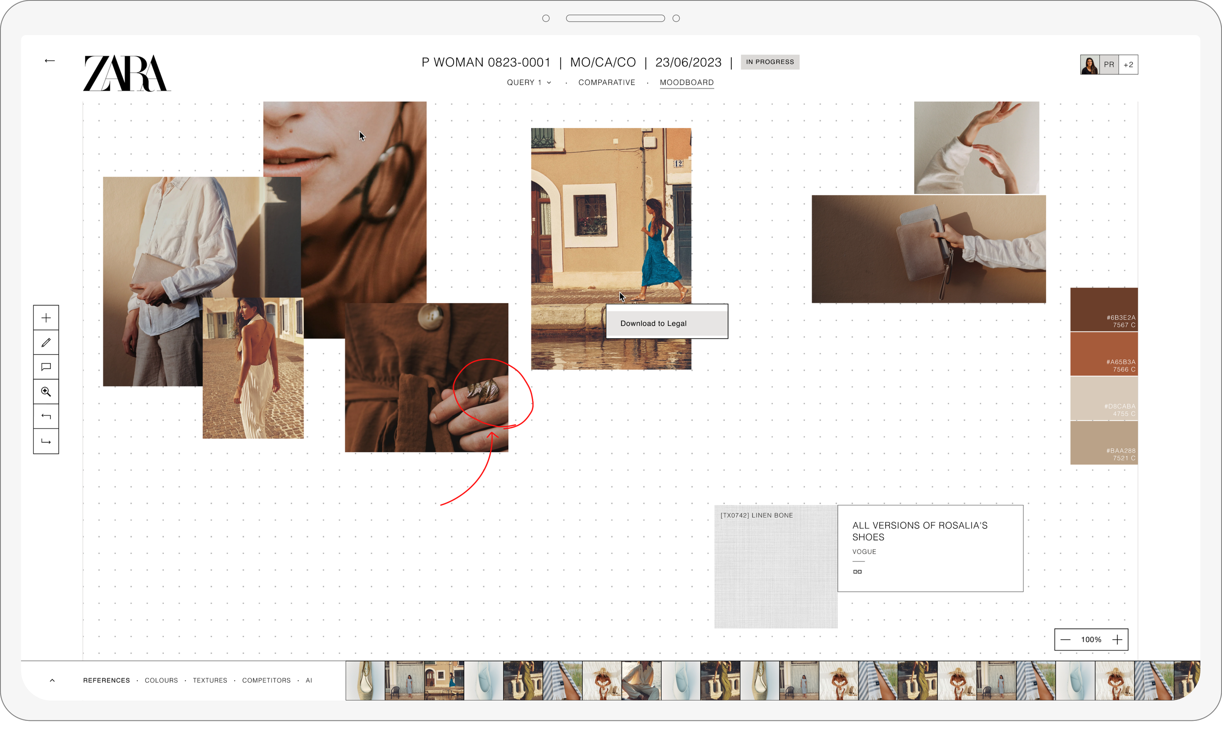
Legal downloads files that believe are relevant for feedback or final verdict
Feature #3
Design goal: Efficiency
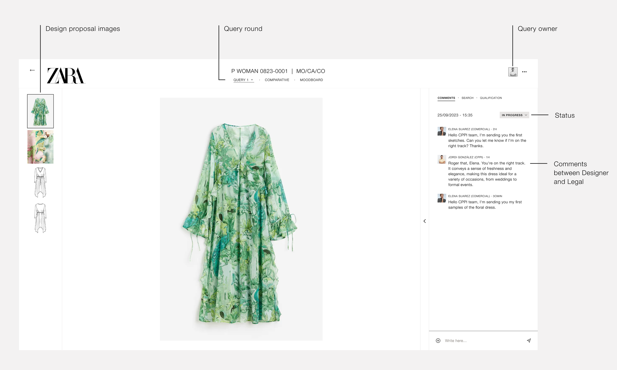
Query detail page
The Query Detail page brings everything into one view — proposal images, conversation, and status. Designers can share sketches or samples, and Legal can comment and approve directly.
Centralising all information makes the process faster and removes unnecessary back-and-forth.
Feature #4
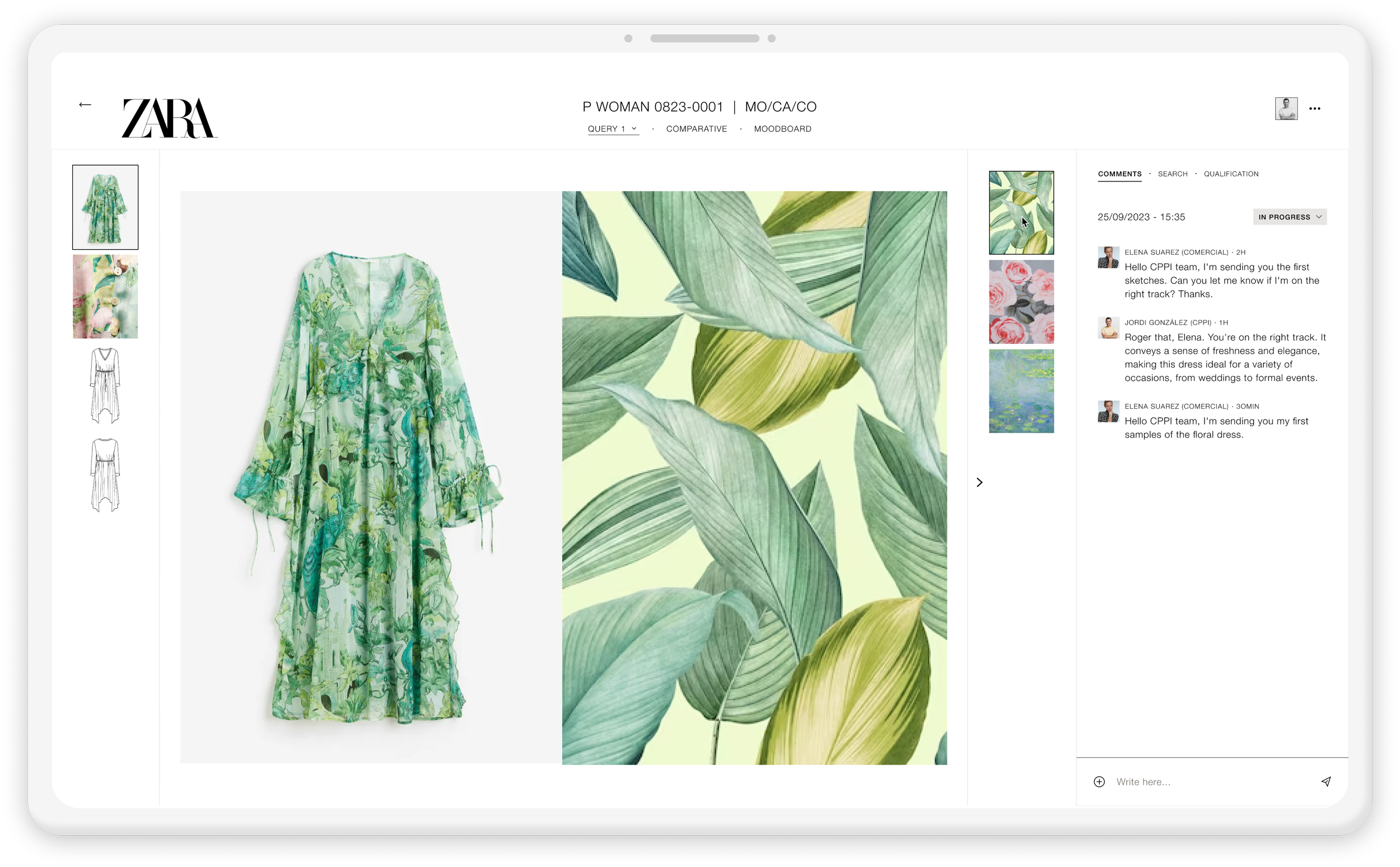
Design goal: Simple
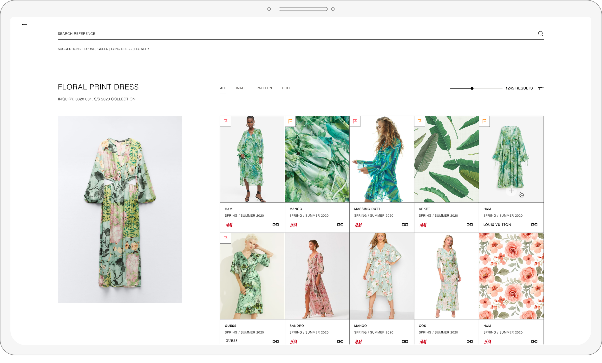
Easy comparison
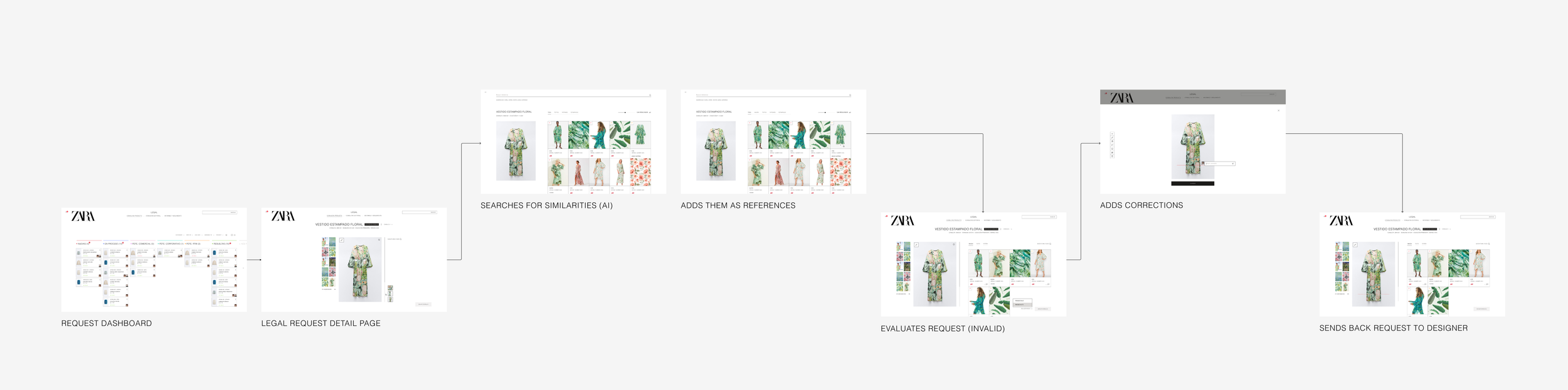
Before, checking for plagiarism or similarity meant searching in different places and doing manual reviews. Now, the product makes it simple to compare the garment sent by the designer with the references collected by Legal, all in one view.
It also allows side-by-side comparison with the inspiration board, making the review process faster and more reliable.
Feature #5
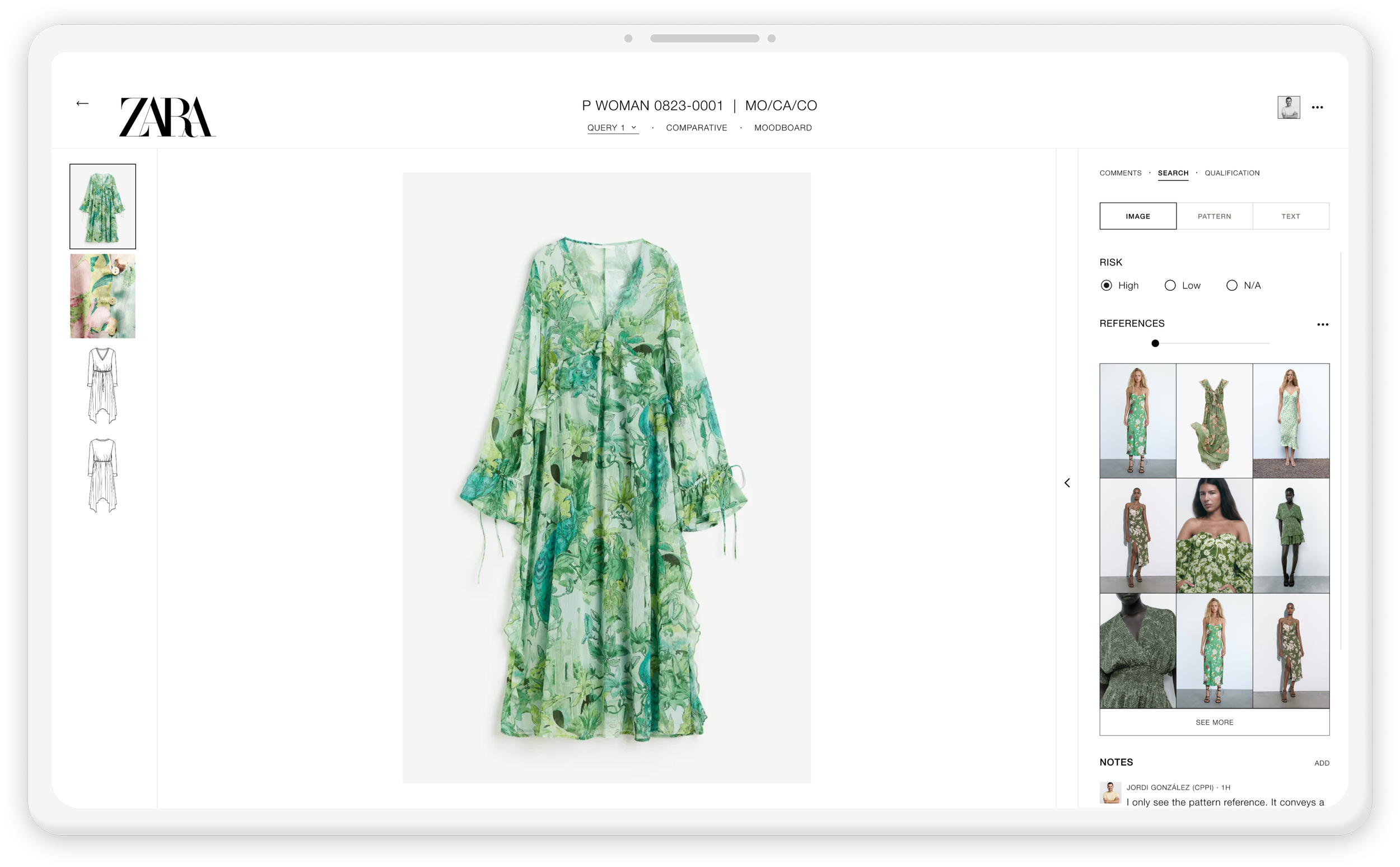
Design goal: Efficiency
AI-Powered Image Search
Legal teams used to rely on manual Google searches to check plagiarism risks — slow and inconsistent. The new AI image search scans each design automatically and compares it against internal and online references, flagging similarities in seconds. This replaces a manual, error-prone task with a faster and more reliable workflow.
Feature #6
Design goal: Cohesive
Consultations history
Verdicts used to be shared in different places, making past decisions hard to track. Now, all comments, revisions and final verdicts stay in one place. Once Legal submits a decision, the status updates automatically and syncs with the Kanban view so everyone can see the outcome immediately.
Feature #7
Design goal: Efficiency
Verdicts made simple
The final stage of the review allows Legal to issue a verdict directly within the enquiry. They can mark a design as approved, needs revision, or rejected, adding contextual comments when needed.
Once submitted, the verdict instantly updates the status and notifies the Design team, ensuring everyone stays aligned and the process keeps moving without delays.